
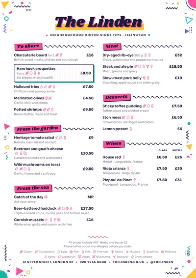
 Memphis
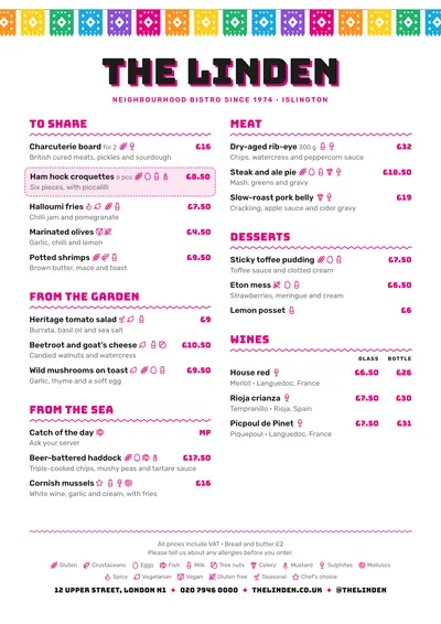 Taquería
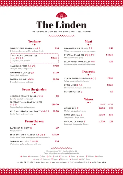 Feria
Feria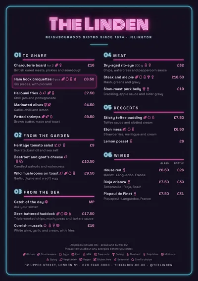 Neon
Neon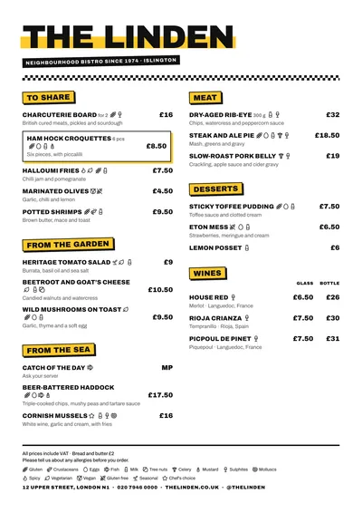 Block
Block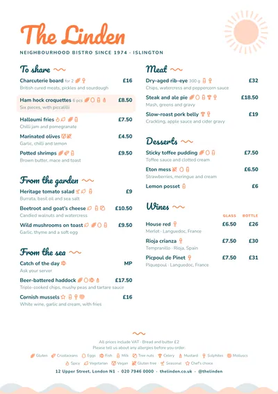 Beach Bar
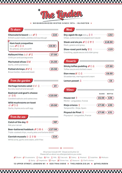 Diner
Diner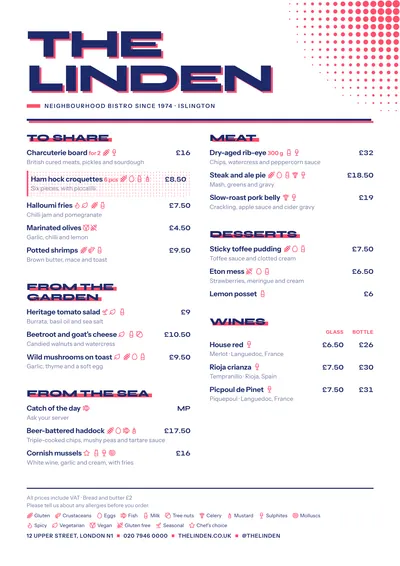 Screenprint
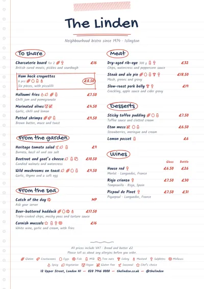 Notebook
What makes a menu original
An original menu isn’t the one that piles on colours, but the one with a concept: a garland of papel picado, a neon sign, a notebook page, a fifties diner. When the concept is clear, everything else (type, colours, ornaments) follows from it.
Type. Fonts with personality (heavy, sign-painted, handwritten, slanted) go on the venue’s name and the headings. For the dishes, a clear font.
Colour. Three or four colours have their place here, but in the ornaments: bunting, confetti, polka dots, stripes. The text stays in a dark ink on a white background.
Shapes. Stickers, badges, labels, pills for the prices. Things you recognise at a glance and that make the menu look good in photos.
The rule: party in the borders, clean dishes
All the designs in this guide follow the same logic: the ornament takes the margins, the header and the section headings, while the dish area stays white, with readable type and aligned prices. That way the menu is fun at first glance and reads just as well at second glance. If you add colour yourself, add it to the accent, not to the descriptions.
Common mistakes
- Colour in the text. Descriptions in pink and prices in yellow: they get lost.
- Fun type for everything. A sign-painter font across three lines of description is tiring by the second section.
- Dish names nobody understands. “The Volcano” is fine if what it is appears underneath.
- Printed dark backgrounds. A black background looks good on screen, but on paper it uses a lot of ink.
- Everything highlighted. If every dish has a star, no star means anything.
How to write the dishes with wit
Make the joke in the name and be literal in the description:
- “The Lola”: double burger, cheddar, caramelised onion and house sauce.
- “Taco of the day”: ask what’s in the pot today.
Sections can have names of their own too, as long as it’s clear what’s in them. And if your guests are international, check that a playful name still makes sense once translated.
Nine designs that break the mould
Memphis: confetti of triangles, zigzags and dots, Shrikhand type and tilted pink blocks. For ice cream parlours, waffle shops and brunch.
Taquería: a garland of colourful papel picado, Bungee type and a magenta accent. For Mexican restaurants, cantinas and street food.
Feria: polka-dot ruffles, a fan above the name and red poster headings. For tapas bars and Spanish restaurants.
Neon: a dark background, a glowing name and a cyan tube frame. For cocktail bars and, above all, for screens and social media.
Block: yellow marker, a chequered stripe and headings like stickers. For burger joints and food trucks.
Beach Bar: Pacifico type, a sun in the corner and waves along the foot. For the beach and summer terraces.
Diner: chequerboard, the name in red script and prices in pills. For breakfasts, milkshakes and burgers with a retro wink.
Screenprint: two inks with the registration slightly off and a halftone pattern. Original without being loud, for specialty coffee shops.
Notebook: a lined notebook page, washi tape and headings circled in red. For cafés and charming daily menus.
Formats: where they shine
Original menus get shared. The same content gives you the 4:5 post and the 9:16 story for social media, and the 16:9 screen for the TV in your venue; Neon is made for them. On paper, the A3 poster turns the menu into a window poster, and A4 remains the table format.
Compare the designs with your own dishes in the menu designs gallery and, if you’re unsure about colours, the guide to restaurant menu colours will help you choose the accent. To keep it readable along the way, go over restaurant menu design.
Frequently asked questions
Doesn't such a colourful menu use a lot of ink?
Less than you'd think: in these designs the colour is in the ornaments around the edges and in the headings, and the rest is white paper. The exception is Neon, with its dark background, which is mainly meant for screens.
Can I change the colours of the ornaments?
In most of them, yes: they follow the accent colour. Some multicoloured ornaments, like the papel picado in Taquería or the confetti in Memphis, have a fixed palette because they're pure decoration.
Does a fun menu work for a serious restaurant?
It depends on your guests. If you want a different touch without losing formality, choose a design with a single graphic idea and little colour, such as Screenprint or Notebook.