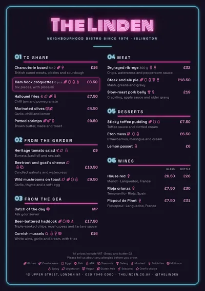
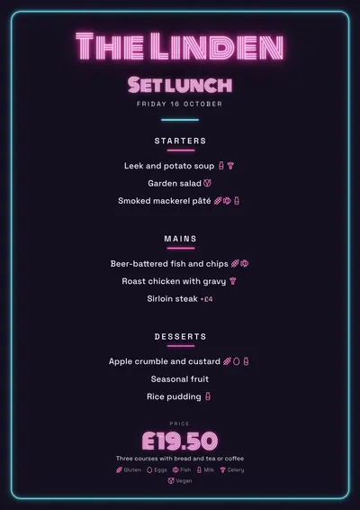
A glowing sign
Neon is the only dark style in the collection. The paper is an almost black violet, the text is a slightly lilac white and the venue’s name glows pink in Monoton, a typeface of parallel lines that imitates neon tubes. A round-cornered cyan frame with its halo runs round the whole page like a lit tube.
Sections carry a large pink number (01, 02, 03…), the title in spaced capitals and a rule that fades out towards the right. Dishes are set in Space Grotesk, a technical-looking sans serif. A featured dish lights up with a pink border and a soft glow.
Designed for the screen
It looks best with its own light: the venue’s TV as a 16:9 screen, a 4:5 post or a 9:16 story. For a cocktail bar that posts its menu or tonight’s specials on social media, it is the most eye-catching style.
It can be printed like any other, but the dark background covers the whole page and uses a lot of ink. If you change the paper to white, change the ink to a dark colour too.
The menu it suits
Cocktail bars, late-night bars and nightlife venues, with short menus: classics, signature cocktails, alcohol-free drinks and something to nibble. The pink accent marks the numbers and the name; the cyan is just decoration for the frame. More ideas in the cocktail menu guide.
If you want an elegant cocktail bar on white paper, compare it with Déco.
Tips to get the most out of it
- Use it mainly on screen: the venue’s 16:9 TV, 4:5 posts and stories. It glows brightest with its own light.
- If you print it, bear in mind that the dark background covers the whole page and uses a lot of ink.
- If you change the accent, choose a saturated colour (acid green, orange, cyan): it is the one that lights up.
- Keep descriptions short: light text on a dark background is tiring in long paragraphs.
Colours, fonts, columns and format can all be changed in the editor without losing the design. It works on A4, US Letter, slim A4, A5, booklet, tri-fold, A3 and images for social media.
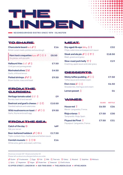 Screenprint
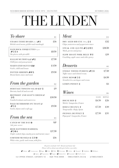 Milano
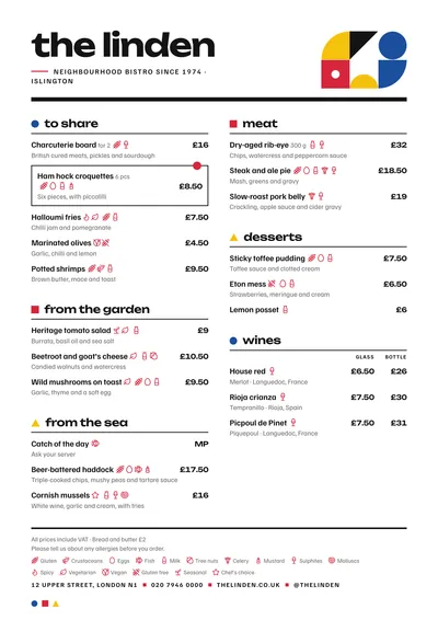 Bauhaus
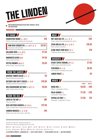 Constructivist