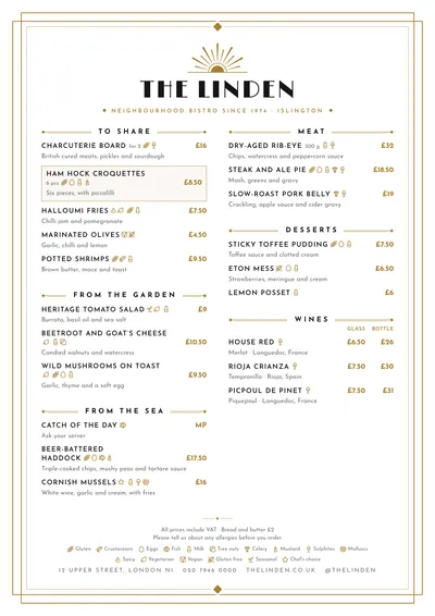
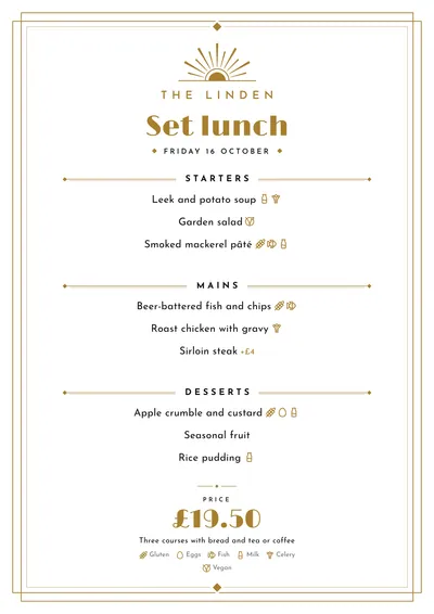
Gold rays and stepped corners
Déco takes its cue from 1920s art deco: luxury hotels, picture palaces and cocktail bars full of brass. A fan of gold rays opens above the name, like a rising sun. The name is set in Limelight, a poster face from that era, in capitals; the subtitle is in spaced capitals between small diamonds.
The whole page sits inside a double frame with stepped corners. Sections are introduced between rules ending in diamonds, with the title in spaced capitals. Dishes are in capitals in Josefin Sans, a geometric face with a vintage air, and prices in gold.
The menu it suits
Cocktail bars, hotel bars, classic restaurants and gala dinners. For cocktails, write the name with the ingredients underneath; for a food menu, one-line descriptions. It works with mid-sized menus; for a very long one, a booklet with a cover keeps the sense of occasion.
It is the style behind the Christmas menu template: in daily menu mode the title is set large in gold Limelight, with the venue’s name smaller above it, and it feels like a real celebration.
Formats where it shines
- A4: the full menu in its frame.
- Slim A4 (140 × 297 mm): a one-column cocktail list.
- A5: set menus or one-day menus.
- Booklet: with a cover, for long menus.
More ideas for organising classics and signature cocktails in the cocktail menu guide.
Tips to get the most out of it
- On an office printer the gold comes out as a warm ochre: that is expected. Do a test print before a big run.
- For cocktails, write the name with the ingredients underneath separated by commas: on a short line it looks very clean.
- If gold doesn’t suit your venue, try the accent in black or emerald green; it still feels very 1920s.
- The frame and the sunburst already do plenty of decorating: don’t highlight more than one dish per section.
Colours, fonts, columns and format can all be changed in the editor without losing the design. It works on A4, US Letter, slim A4, A5, booklet, tri-fold, A3 and images for social media.
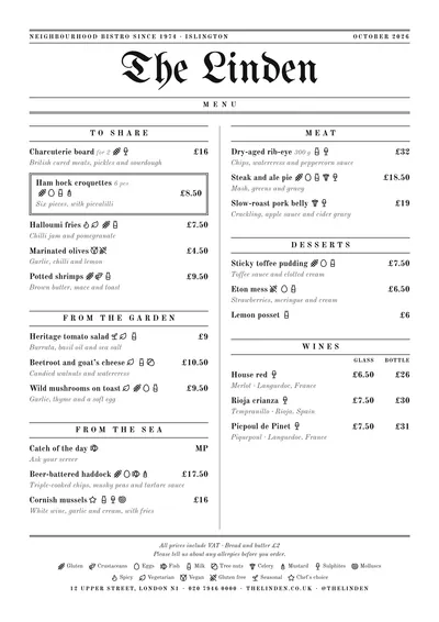 Gazette
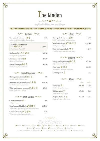 Modernista