Barcelona in 1900
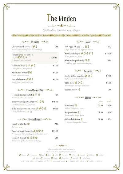
Modernista takes its cue from Catalan Art Nouveau: cafés with stained glass, wrought-iron signs and façades covered in broken-tile mosaic. The page sits inside a fine frame with whiplash corners, those curves that curl like a stem, finished with little buds. The venue’s name is set in Smythe, an Art Nouveau-inspired typeface, with an ornamental initial.
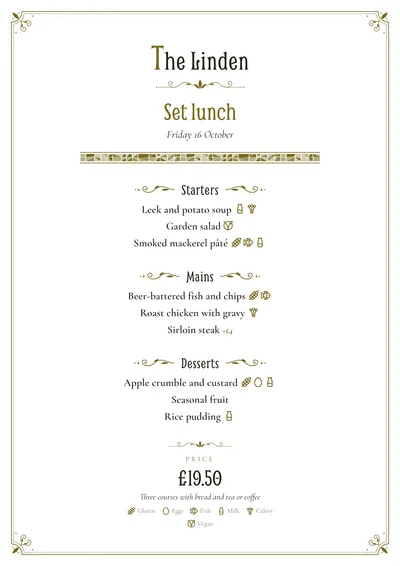
Section titles sit between flourishes, and dishes are set in Cormorant Garamond, an elegant roman at a good size, with descriptions in italics. A featured dish is framed in a leaf-shaped cartouche. On the daily menu there is also a frieze of broken-tile mosaic, Gaudí-style shards in shades of the accent, under the title.
The menu it suits
Classic cafés, vermouth bars, period restaurants, tea rooms and venues in historic buildings. It suits mid-sized menus: its type starts at a large size and, although the size adjusts itself, a booklet stops long menus from getting cramped.
Use the italic descriptions for origin and method, in short phrases: “Salt cod baked with paprika and garlic”.
Formats where it shines
- Two-column A4: the full menu inside its frame.
- Booklet: with front and back covers, for long menus.
- A5: the daily menu, with the mosaic frieze under the title.
- A3 poster: at the entrance, like a period poster.
All the ornament follows the accent, which is an olive gold by default. If you are after another era, compare it with Déco, from the 1920s, or Gazette, with its old-newspaper feel.
Tips to get the most out of it
- All the ornament follows the accent: an olive gold, an ochre or a burgundy suit it; cold or bright colours don’t.
- Use the italic descriptions for origin and method, in short phrases.
- Its type starts at a large size: with long menus, a booklet stops it getting cramped.
- On the daily menu a broken-tile mosaic frieze appears under the title, setting it apart from the main menu.
Colours, fonts, columns and format can all be changed in the editor without losing the design. It works on A4, US Letter, slim A4, A5, booklet, tri-fold, A3 and images for social media.
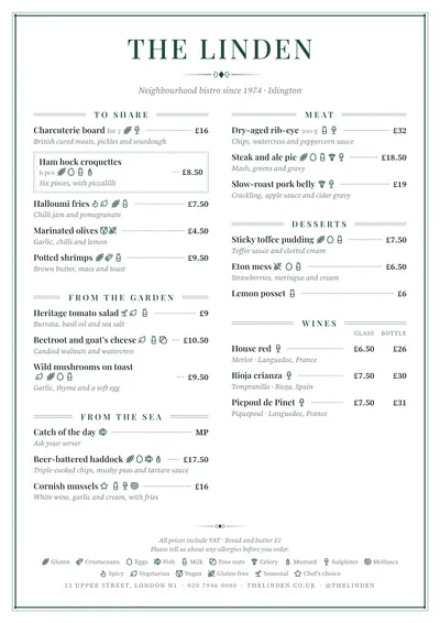 Brasserie
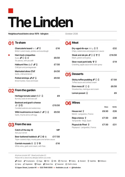 Swiss
Swiss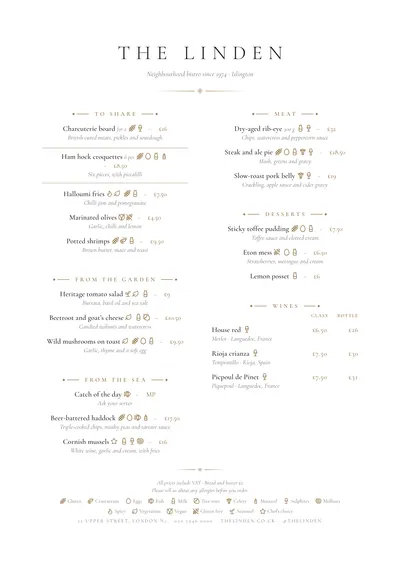 Sobremesa
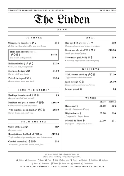 Gazette