1980s confetti
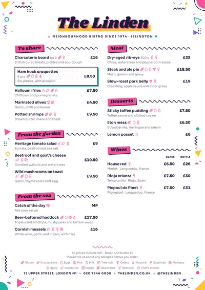
Memphis takes its name from the Italian design group that filled the 1980s with triangles, zigzags and impossible colours. The margins of the page are scattered with confetti: squiggles, triangles, dots, circles and zigzags in pink, yellow, turquoise and purple. The venue’s name is set in Shrikhand, a heavy, slanted typeface, with a pink shadow on a yellow block.
Section titles are slanted pink blocks trailing a wavy black squiggle. Dishes are set in Sora, clear and geometric, with prices in bold. A featured dish is a card with a turquoise shadow.
The menu it suits
Ice cream parlours, brunch spots, waffle and crêpe bars, milkshakes and street food. Short, cheerful menus with fun names and a line of description that says what each thing is. The decoration stays in the margins and the headers; the dishes area is white, so it reads effortlessly.
For ice creams and shakes in several sizes, use price columns with headings (“Small”, “Medium”, “Large”). And mark allergens carefully: on a dessert menu, milk, egg, gluten and nuts appear on almost every line.
Formats where it shines
- Two-column A4: the full menu with confetti all around.
- 4:5 post and 9:16 story: the confetti and colour blocks look great on a phone.
- A3 poster: in the window of an ice cream parlour.
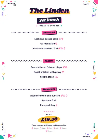
- Daily menu: the title on a dark block, headings in pink and the price on a yellow splash.
If you like the colour but want something more graphic and less festive, compare it with Screenprint or Bauhaus.
Tips to get the most out of it
- The confetti stays in the margins: don’t add more colour to the descriptions, dishes need to read on white.
- It suits short, cheerful menus: ice creams, waffles, milkshakes, toppings.
- The pink follows the accent and the black follows the ink; the rest of the confetti has fixed colours.
- As a 4:5 post or a story, the confetti and the colour blocks look great on a phone.
Colours, fonts, columns and format can all be changed in the editor without losing the design. It works on A4, US Letter, slim A4, A5, booklet, tri-fold, A3 and images for social media.
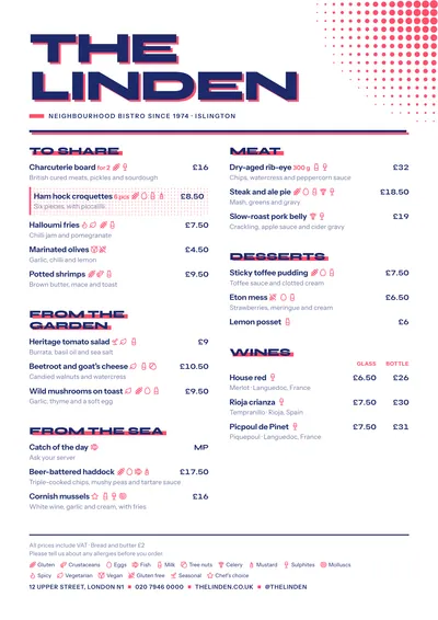 Screenprint
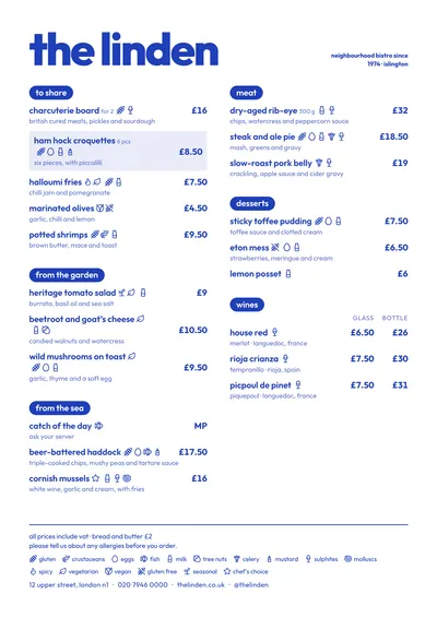 Riviera
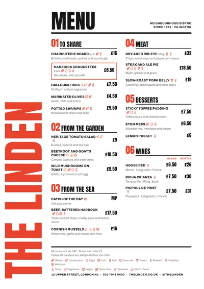 Poster
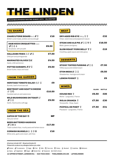 Block
Block