The name, on its side
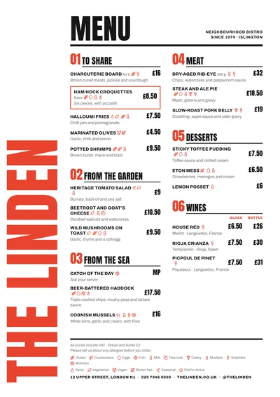
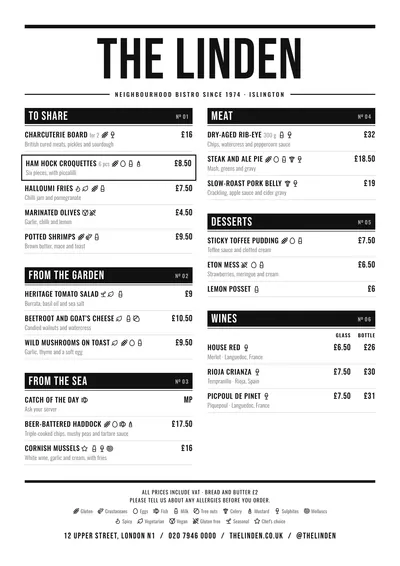
Poster builds the menu like a typographic poster. At the top, the word “Menu” in Anton, a very black, very tall condensed face; beside it, the subtitle in small type, aligned right. The venue’s name does not sit at the top: it runs vertically up the whole left edge of the page, in the red accent and as large as it will fit.
Sections are numbered (01, 02, 03…) with red figures in the same typeface as the headline. Dishes are in capitals in Archivo, with the description in lowercase underneath, and prices in bold on the right at a good size. A featured dish is marked with a red-ruled box.
The menu it suits
It is a style for bars with character: tapas, sharing plates, sandwiches, wines by the glass. It needs well-separated sections and short dish names, because capitals lengthen every line; with very long names the menu becomes dense. The numbering sets a route, so order the sections the way you want them read.
Price columns (small and large, glass and bottle) carry their heading at the top of the section and line up with the rest of the figures.
Formats where it shines
- A4: the original layout, with the name running from top to bottom.
- A3 poster: almost literally; hung next to the bar it works as a poster.
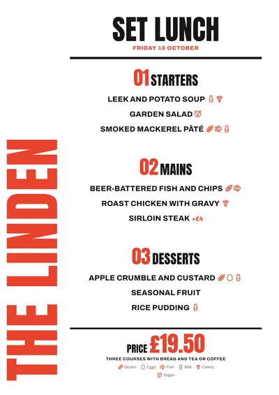
- Daily menu: the headline becomes “Set menu of the day”, with numbered starters, mains and desserts and the price large in red.
With short venue names the effect is stronger: four or five letters running vertically fill the page. If you change the accent, choose a colour with weight: red, orange, electric blue.
Tips to get the most out of it
- Short names work best: the vertical name fills the full height of the page, and a long one shrinks a lot.
- Keep the red or another strong accent: the section numbers and the vertical name need a colour with weight.
- Put the sections in the order you want them read: the 01, 02, 03… numbering sets the route.
- Go for short dish names: they are set in capitals, and long ones make the menu dense.
Colours, fonts, columns and format can all be changed in the editor without losing the design. It works on A4, US Letter, slim A4, A5, booklet, tri-fold, A3 and images for social media.
 Riviera
 Vermouth
 Counter
 Feria
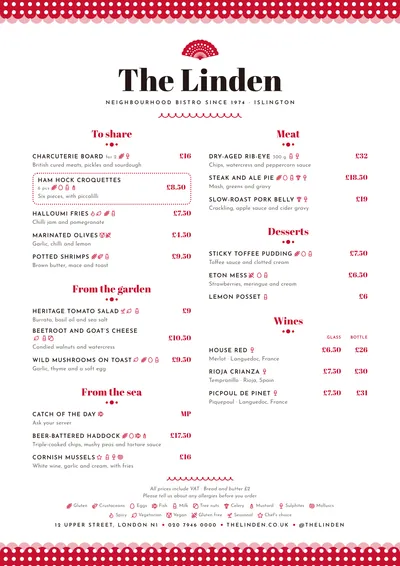
Feria