A bottle label
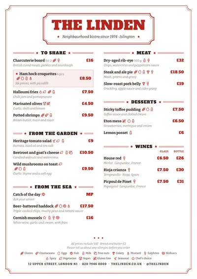
Vermouth borrows the look of vermouth labels and old liqueur bottles. The header is framed by a double rule with clipped corners, and inside it sits the name in Alfa Slab One, a poster slab serif, in red capitals. The subtitle is in italics between two stars, and the whole page has a fine double frame.
Section titles are slab letters between stars and triple rules. Dishes are set in Bitter, a text slab serif, with descriptions in italics and prices in bold red. A featured dish has a star in front of it and a very pale pink background.
The aperitivo menu
It is a style for a traditional Spanish-style bar: vermouth, tinned fish and preserves, pickles, tapas, sharing plates and a few fried bites. It suits a medium-sized menu with price columns (tapa and full portion, glass and bottle) and items sold per piece or per tin.
Order it the way people order: vermouth first, then what goes with it. And give dishes their bar names (gilda, boquerones, patatas bravas), without frills.
Formats where it shines
- Two-column A4: the full layout with its label.
- A3 poster: behind the bar, like an old sign.
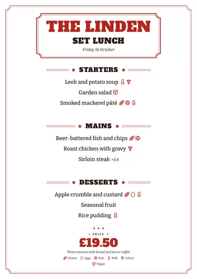
- Daily menu on A5: the label holds the name, the title and the date, and the price goes at the bottom in red slab lettering.
If you want the same feel with even more old-label craft, compare it with Tinned. For a more restrained tavern, try Counter.
Tips to get the most out of it
- Open the menu with the vermouths and put the tinned fish straight after: that is the order people ask for them at midday.
- Give the weight or pieces next to the name of each tin (120 g, 8 pcs) so the price makes sense.
- The red is part of the style; if you change it, look for another old-label colour, such as bottle green or ink blue.
- As an A3 poster behind the bar it looks like an old wine merchant’s sign.
Colours, fonts, columns and format can all be changed in the editor without losing the design. It works on A4, US Letter, slim A4, A5, booklet, tri-fold, A3 and images for social media.
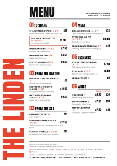 Poster
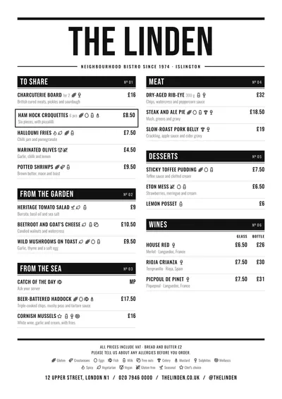 Counter
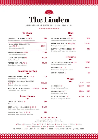 Feria
Feria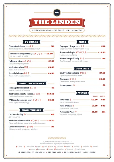 Tinned