Handwritten, but legible
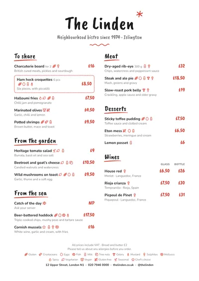
Chalkboard imitates what gets chalked up on the board by the door, but on white paper. The venue’s name is set in Caveat Brush, a brush script, with a red asterisk scribbled in the corner and a red wave drawn under the subtitle. Each section title has a red brushstroke underneath, like a quick underline.
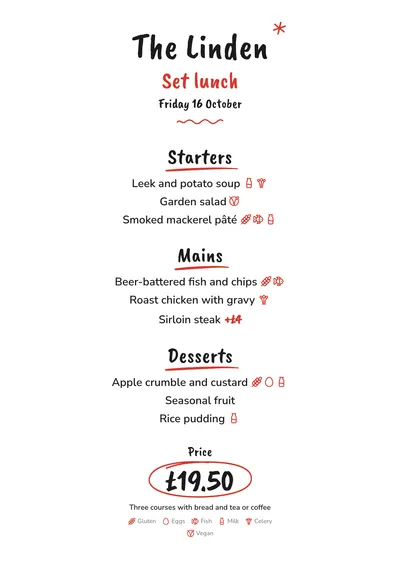
The handwriting stays in the name, the headings and the price. Dishes are set in Nunito Sans, rounded and very clear, and prices in red. A featured dish is boxed in with a dashed red line, and on the daily menu the price appears circled by hand with a red oval.
Made for the daily menu
This is the style designed for the daily set menu: starters, mains, desserts, the price and what it includes. Supplements go next to the dish (+£4), in red and smaller. Because it is a short list, the type grows by itself and the page can be read from the bar.
It also works as an informal two-column A4 menu, with prices in red on the right.
Formats where it shines
- A5: the natural format for the daily menu.
- Two A5s per sheet: print one sheet, cut it in half and you have two menus.
- 4:5 post and 9:16 story: the same menu, ready to share on social media.
- A3 poster: for the door or the window.
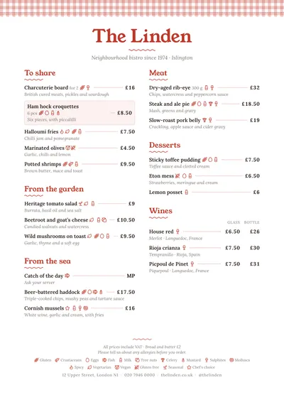
If you want something more like a traditional eating house, compare it with Tablecloth. And to organise the dishes and the price, see the guide on how to make a set lunch menu.
Tips to get the most out of it
- Print the daily menu as two A5s per sheet: cut it in half and you get two menus from a single sheet.
- Export the same menu as a 4:5 post or a story to share on social media every morning.
- Use the dishes’ everyday names, without long descriptions: the point is to read it at a glance.
- Say under the price what it includes: bread, a drink, dessert or coffee.
Colours, fonts, columns and format can all be changed in the editor without losing the design. It works on A4, US Letter, slim A4, A5, booklet, tri-fold, A3 and images for social media.
 Tablecloth
 Notebook
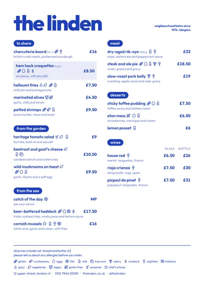 Riviera
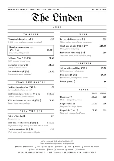 Gazette