A newspaper front page
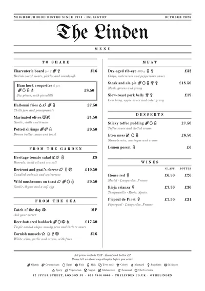
Gazette borrows the conventions of the old press. The venue’s name is set in blackletter, like a newspaper masthead; above it, a line with the subtitle on the left and the month on the right, between double rules. Below the name, a band with the word “Menu” in spaced capitals.
Sections open between rules, with the title in small caps, and a vertical line, the column rule, separates the two columns as on a newspaper page. A featured dish sits in a double-ruled box, like an advert. The text is set in Old Standard, a roman inspired by the books and papers of the late 19th century, with descriptions in italics.
A traditional menu with a period look
It is a forgiving style for long, traditional menus: eating houses, pubs, neighbourhood bars with a kitchen, traditional grills. The two dense columns, the column rule and the rules keep lots of dishes in order without the page looking like a phone book. Prices are in bold on the right and glass and bottle columns line up under their headings.
Everything is black on white, so it prints well on any printer and doesn’t suffer from photocopying.
Daily menu and formats
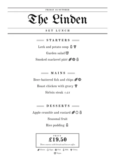
On the daily menu, the date moves up to the top line, the band changes to “Set menu of the day”, the dishes are centred under headings flanked by rules and the price sits in a double-framed box. It looks great on A5 or as two A5s on one A4 sheet.
For the menu, A4 recreates a newspaper front page; as an A3 poster on the wall it looks like a framed newspaper. If you want to age it, change the ink to a dark sepia.
Tips to get the most out of it
- Fill in the subtitle: it appears in the top line like the paper’s motto, and an “est. 1974” works wonders there.
- In black on white it prints perfectly on any printer and copes well with photocopying.
- If you change the ink, try a dark sepia or a tobacco brown to age it a little.
- The blackletter is only used for the name. With names of more than three words it gets heavy: try shortening it in the header.
Colours, fonts, columns and format can all be changed in the editor without losing the design. It works on A4, US Letter, slim A4, A5, booklet, tri-fold, A3 and images for social media.
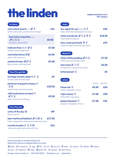 Riviera
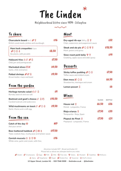 Chalkboard
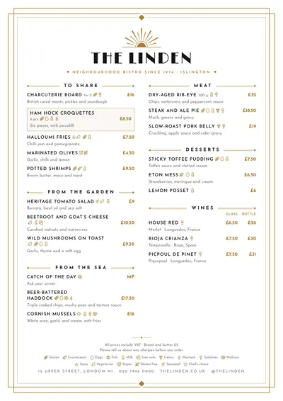 Déco
Déco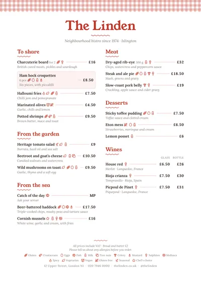 Tablecloth