 Sobremesa
 Brasserie
 Bodega
 Milano
 Déco
Déco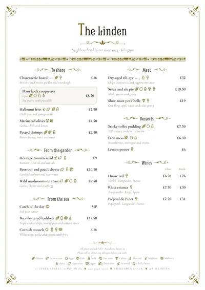 Modernista
 Sumi
SumiWhat makes a menu elegant
The type. Almost every elegant menu uses a classic serif: a Garamond, a Bodoni, a high-contrast roman. Letter-spaced small capitals for headings and italics for descriptions give hierarchy without needing bold or colour. One family, or two at most.
The space. Generous margins and few things per page. It’s what shows most and what costs most, because it forces you to cut the menu. An elegant menu with forty dishes crammed onto an A4 doesn’t exist.
The colour. One dark ink and a muted accent: old gold, burgundy, bottle green. The accent goes on details (headings, rules, an ornament), never on paragraphs.
The price. Discreet. After the dish or in a narrow column, without the £ sign on every line and with the same decimal format across the menu.
The paper and the cover. Matt paper with some weight, white or pale ivory. A cloth or leather menu cover, or a simple board. Glossy plastic and reflective sleeves spoil any design.
Mistakes that cheapen the menu
- Gold everywhere. One gold ornament is elegant; ten are a wedding invitation.
- Script type in the descriptions. It suits the venue’s name, not three lines of text.
- Everything in capitals. Letter-spaced capitals work in short headings; across the dishes they’re tiring.
- Printed dark backgrounds. They look great on screen, but on paper they read worse in low light and use a lot of ink.
- Brochure adjectives: “exquisite”, “delicious”, “sublime”. The guest decides that.
- Prices corrected by hand or with a sticker. If a price changes, reprint.
How to write the dishes
The elegant tone is restrained. Name the produce, its origin if it adds something, and the technique, and leave out the rest:
- “Cornish turbot, mussels, sea herbs, Champagne sauce”
- “Roast squab, its jus, beetroot and cocoa”
Commas replace “with” and “on”. One line per description, two at most. If you have international guests, a bilingual menu with the translation under each dish looks more polished than two separate menus. Always check the translation, especially product names.
Seven designs for an elegant menu
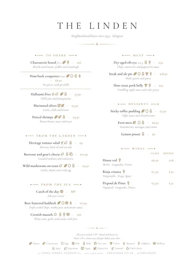
Sobremesa is the most classic fine-dining option: everything centred, widely spaced capitals in Cormorant Garamond, gold diamonds between rules and a small price after each dish. For short menus and tasting menus.
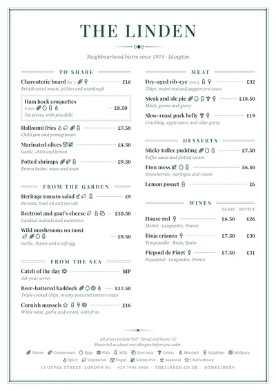
Brasserie frames the page with a double rule and runs each dish to its price with a fine line. It handles long menus without losing its composure; ideal for classic cafés and hotel restaurants.
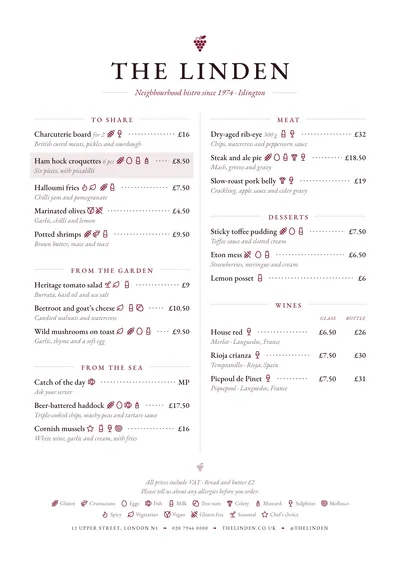
Bodega uses EB Garamond, a bunch of grapes in the header and aligned glass and bottle columns. Perfect for the wine list and, to match, the food menu of a classic restaurant.
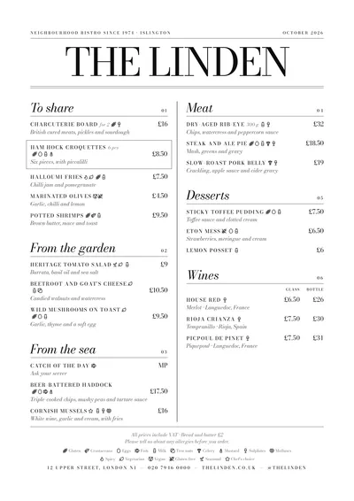
Milano is elegance in black and white: huge Bodoni, large italic headings and dishes in small capitals. For modern Italians, cocktail bars and design-led restaurants.
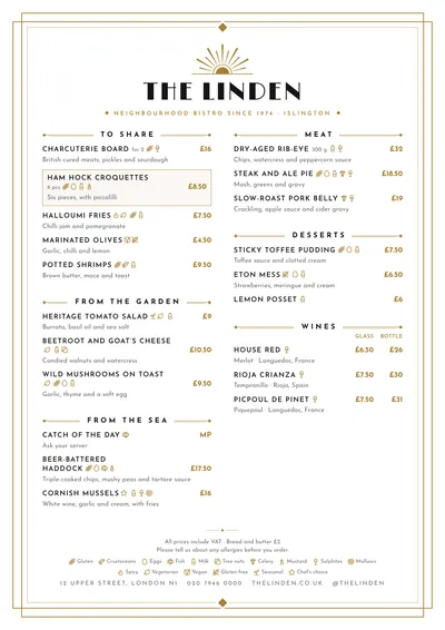
Déco brings back the glamour of the 1920s: a gold sunburst fan, a stepped frame and Limelight type. For cocktail bars, hotels and gala dinners.
Modernista has whiplash corners, flourishes and a trencadís mosaic frieze on the daily menu. A period elegance for historic cafés and tea rooms.
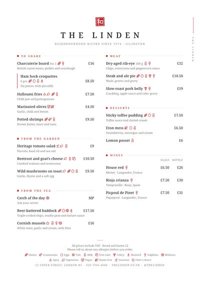
Sumi is elegance by subtraction: a red seal, widely spaced capitals and lots of white. For Japanese cooking and any short menu looking for calm.
Format and finish
Elegance likes slender formats. The slim A4 (140 × 297 mm) gives a tall, narrow column you can hold in one hand; the booklet lets you spread a long menu, with front and back covers, without cramming anything. For a tasting menu or a set menu, a centred A5 is enough.
In any design you can change the ink, the accent and the paper colour, as well as the heading and text fonts, without breaking the composition. Compare them all in the menu designs gallery. To go deeper into choosing type, see menu fonts; the general rules of hierarchy and space are in restaurant menu design.
Frequently asked questions
Which font looks most elegant on a menu?
A classic serif (a Garamond, a Bodoni, a Playfair) at a good size, with small capitals for headings and italics for descriptions. One family, or two at most. Script fonts only for the venue's name.
Should I drop the £ sign?
On an elegant menu that's the norm: prices without a symbol on each line, the same decimal format throughout and a note at the foot such as 'All prices include VAT', plus your service charge policy if you have one.
What paper should I print it on?
A matt paper with a good weight, white or pale ivory. Avoid gloss and lamination: they reflect the room's light and make the menu harder to read.