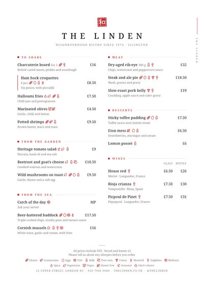
A red seal and blank paper
Sumi takes its name from Japanese ink and its logic from calligraphy: few strokes and lots of white. At the top sits a square red seal, slightly rotated as if stamped by hand, with the character 和. Below it, the venue’s name in widely spaced capitals and a tiny subtitle. In the right margin, the name is repeated vertically next to a red brushstroke.
Sections are marked with a small red square, the title in red small caps and a fine rule. Dishes are set in Noto Serif, a sober serif, with prices aligned right. A featured dish has a vertical red bar on its left.
The menu it suits
It is the natural style for a Japanese restaurant, a sushi bar, a ramen bar or an Asian kitchen that wants to look polished. It works with original names and a short description explaining what goes into each dish; if your guests don’t know the terms, that line is essential. You can put the number of pieces per serving next to the name.
The white space is part of the design. The type size adjusts itself to fill the page, but if the menu doesn’t fit with room to breathe, a larger format is better than squeezing it in.
Formats where it shines
- Slim A4 (140 × 297 mm): a tall, narrow single column, very much a Japanese restaurant look.
- Two-column A4: if you have a lot on offer.
- Booklet: to separate sushi, hot dishes and drinks.
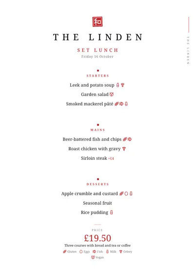
- Daily menu: a red square above each heading and the price in red at the bottom.
If you like its calm but don’t want a Japanese feel, look at Signature or Nordic.
Tips to get the most out of it
- Use the original name (gyoza, tataki, nigiri) and explain in the description what goes into each dish.
- Give the number of pieces per serving next to the name (4 pcs, 8 pcs), especially for sushi.
- Respect the white space: if the menu doesn’t fit with room to breathe, switch to a booklet rather than squeezing it.
- The seal follows the accent colour. If you upload your logo, the seal disappears and your logo takes its place.
Colours, fonts, columns and format can all be changed in the editor without losing the design. It works on A4, US Letter, slim A4, A5, booklet, tri-fold, A3 and images for social media.
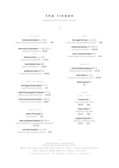 Signature
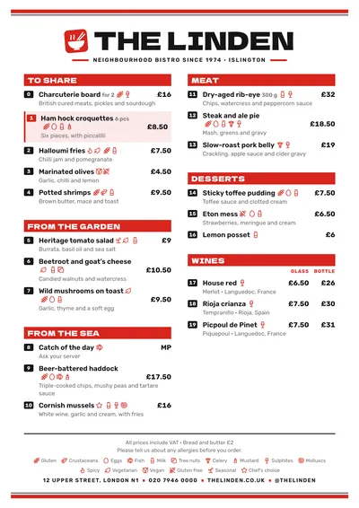 Wok
Wok