Clean and calm
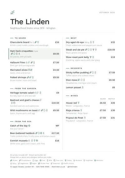
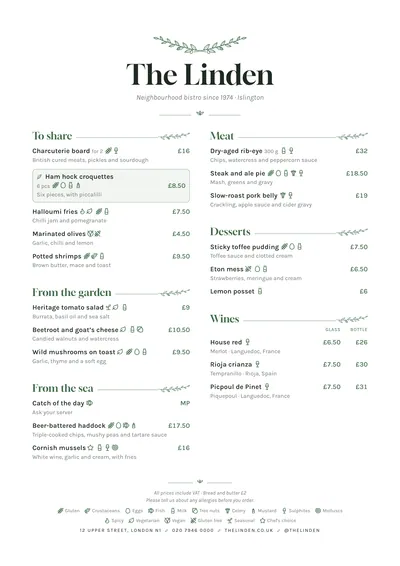
Nordic is the calmest style in the collection. Everything is aligned left, with fine rules and lots of white. At the top, a sprig drawn in sage green; the venue’s name in Work Sans, a sans serif with open shapes, and the month in spaced capitals in the right-hand corner.
Each section starts with a short green dash and the title in small caps, over a fine rule. Dishes use the same typeface, with descriptions in grey and prices on the right. A featured dish has a green bar on the left and a very pale green background.
The menu it suits
Cafés, bakeries that bake on site, healthy food, bowls and salads. It is a menu that lets the ingredients show: put grams or pieces next to the name and mark vegan, vegetarian and gluten-free with their icons, which are explained in the key at the bottom alongside the allergens.
Write without filler adjectives: “Sourdough toast, avocado, lime” says more than “delicious avocado toast”.
Formats where it shines
- Two-column A4: the full menu.
- Slim A4 (140 × 297 mm): a clean single column for coffees and pastries.
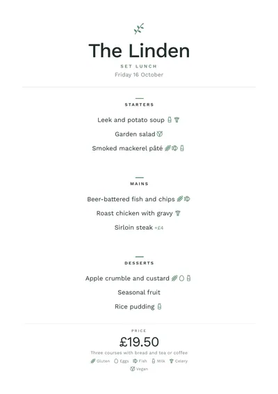
- A5: a centred daily menu, with the sprig at the top and a green dash above each heading.
- A3 poster: behind a bakery counter.
If you want the same order with more punch, compare it with Swiss. If your cooking is garden-led and you want more plant ornament, look at Botanical.
Tips to get the most out of it
- Mark vegan, vegetarian and gluten-free with their icons: on a healthy menu it is the first thing people look for.
- Put grams or pieces next to the name: with bowls and breads it helps people choose.
- Try other muted greens or a greyish blue as the accent; nothing saturated.
- On one-column slim A4 it looks very clean for a coffee menu.
Colours, fonts, columns and format can all be changed in the editor without losing the design. It works on A4, US Letter, slim A4, A5, booklet, tri-fold, A3 and images for social media.
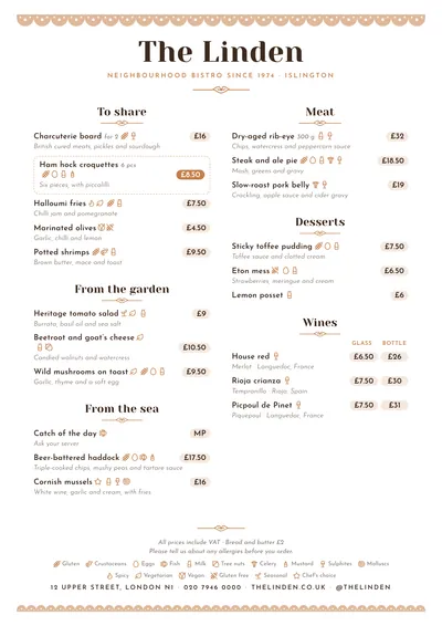 Bakehouse
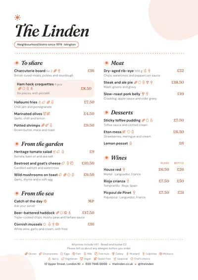 Brunch
 Botanical
 Notebook