Bodoni at cover size
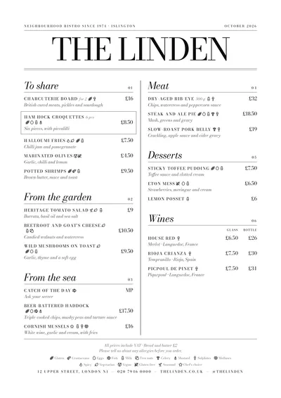
Milano brings the language of fashion magazines to your menu. At the top, a fine line with the subtitle and the month; below it, the venue’s name in Bodoni Moda, in capitals and at a huge size, closed off by a double rule. Bodoni is the roman of maximum contrast: very thick thick strokes and almost invisible hairlines.
Sections open with the title in large italics and its number on the right, in old-style figures, the ones that rise and drop like lowercase letters. Dishes are set in spaced small caps and descriptions in italics. A vertical line separates the columns. Everything is black.
The menu it suits
Modern Italian restaurants, cocktail bars, design-led restaurants and hotel bars. It suits concise dish names, because spaced small caps lengthen every line, and mid-sized menus.
On a cocktail menu, the name in small caps with the ingredients in italics underneath looks straight out of a magazine. In an Italian restaurant, keep the original names (vitello tonnato, tagliatelle al ragù) and use the bilingual version if you need the translation: it sits under each dish, in the same italics.
Formats where it shines
- Two-column A4: the full magazine masthead.
- Slim A4 (140 × 297 mm): a slender single column, ideal for a cocktail list.
- A3 poster: at the entrance, like a magazine cover.
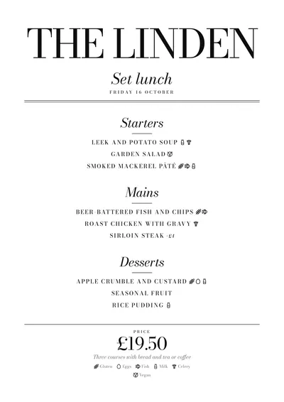
- Daily menu: a huge name, the title in italics and each dish in centred small caps.
If you want the same magazine idea with a touch of colour, compare it with Editorial. For a more neighbourhood pizzeria, try Trattoria.
Tips to get the most out of it
- Keep it black: the style lives on Bodoni’s contrast, not on colour.
- Short venue names look best in a header at a huge size.
- Spaced small caps lengthen dish names: try to keep them concise.
- Bodoni’s hairlines need good printing: check a proof before printing them all.
Colours, fonts, columns and format can all be changed in the editor without losing the design. It works on A4, US Letter, slim A4, A5, booklet, tri-fold, A3 and images for social media.
 Screenprint
 Bauhaus
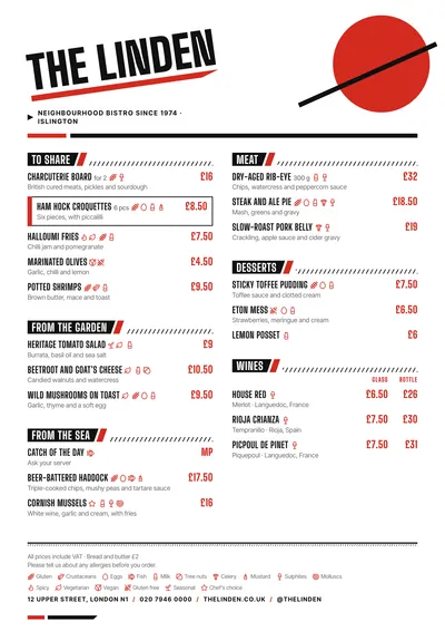 Constructivist
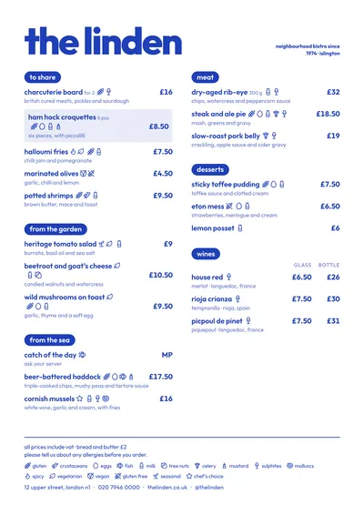 Riviera