Gingham and red italics
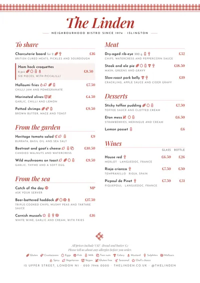
Trattoria puts a ribbon of red gingham along the top of the page, like the edge of a trattoria tablecloth. The venue’s name is set in Playfair Display italic, in red; the subtitle in spaced capitals between two rules. At the foot, a folded checked napkin closes the menu.
Section titles are in red italics with a fine rule underneath. Dishes are set in Josefin Sans, a geometric sans serif with a vintage air, and descriptions in small caps, which makes them look like a list of ingredients. A featured dish has a red bar on the left and a very pale pink background.
The menu it suits
Pizzerias, Italian restaurants and fresh pasta places. Descriptions in small caps call for short lists: “tomato, fior di latte mozzarella, basil”. Write the name in Italian and the ingredients underneath, without adjectives.
If you have two pizza sizes, use two price columns with headings. Pizzas often stack up gluten, milk and sometimes nuts: mark them dish by dish with the icons, numbers or names of the 14 allergens.
Formats where it shines
- Two-column A4: starters, pizzas, pasta and desserts on one page.
- A3 poster: on the wall, with the pizzas in full view.
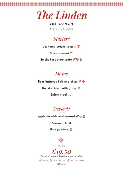
- Daily menu: starters, mains and desserts in red italics and the price at the bottom.
The gingham, the rules and the headings follow the accent; in green it looks like a different trattoria. It shares the gingham with Tablecloth, but it is more refined. More ideas in the pizza menu guide.
Tips to get the most out of it
- If you have two pizza sizes, use price columns (“Medium”, “Large”) with the heading at the top of the section.
- Write the names in Italian (Margherita, Cacio e pepe) and the ingredients in the description.
- Descriptions are set in small caps: keep them as short lists of ingredients, not long sentences.
- In tourist areas, the bilingual version puts the translation under each dish.
Colours, fonts, columns and format can all be changed in the editor without losing the design. It works on A4, US Letter, slim A4, A5, booklet, tri-fold, A3 and images for social media.
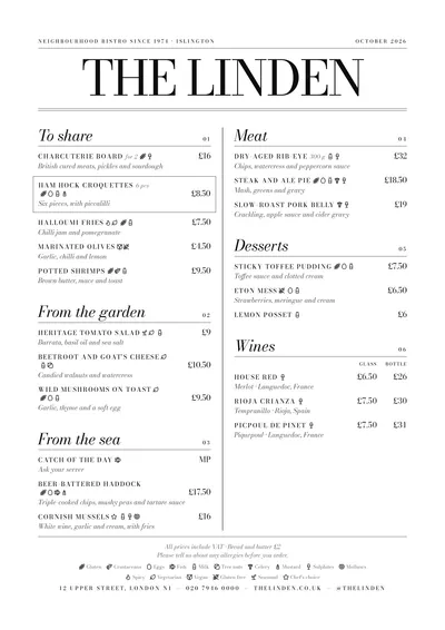 Milano
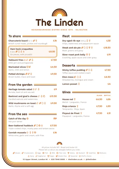 Seventies