A freshly torn receipt
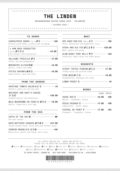
Ticket sets the whole menu in Space Mono, a monospaced face like a cash register’s. The top and bottom edges of the page are jagged, like a receipt torn off the printer. The header sits in a dashed box with a row of asterisks, the name in capitals and the month between dashes.
Sections are separated by dotted rules with the title centred in capitals. Dishes are in capitals, with a line leading to the price, and at the foot there is a decorative barcode with its numbers. Everything is black.
The menu it suits
Wine bars, gastropubs and modern bars with a short menu. Monospaced type lines figures up perfectly, so the glass and bottle columns look like a spreadsheet. It suits short dish names: in capitals and fixed width, a three-line description gets heavy.
The daily menu as a receipt
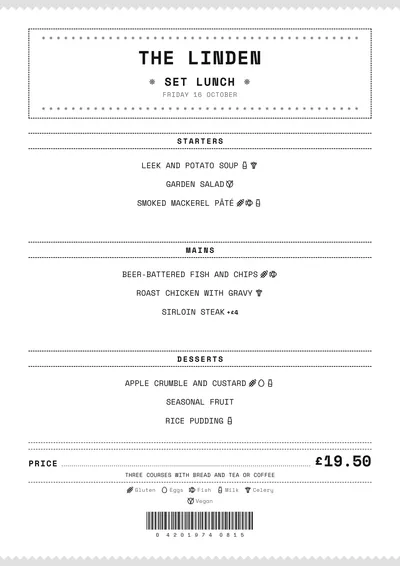
On the daily menu, the title sits between asterisks, each dish on its own line between dotted rules and the price appears as the total line: “Price” on the left and the figure on the right, set large. Underneath come what it includes and the barcode.
Formats where it shines
- Slim A4 (140 × 297 mm): long, narrow and one column; it looks like a real receipt.
- Two-column A4: for wine lists and sharing plates.
- Two A5s per sheet: a daily menu that is cheap to print.
Because it uses a single ink, it prints well on any printer. If you want a touch of colour, change the ink to a dark ballpoint blue. For a more classic wine list, compare it with Bodega.
Tips to get the most out of it
- Keep it black: it prints perfectly on any printer and on a photocopier.
- For wines by the glass and bottle, use two price columns: with fixed-width type, the figures line up to the millimetre.
- On slim A4 it looks like a real receipt: long, narrow and one column.
- Keep dish names short: in capitals and fixed width, long ones quickly take up two lines.
Colours, fonts, columns and format can all be changed in the editor without losing the design. It works on A4, US Letter, slim A4, A5, booklet, tri-fold, A3 and images for social media.
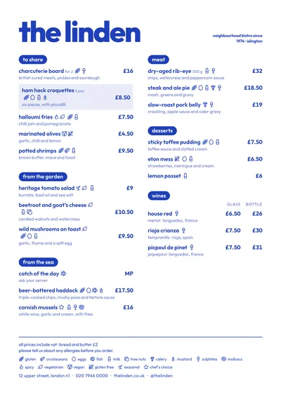 Riviera
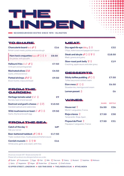 Screenprint
 Poster
 Editorial