Two inks, slightly off register
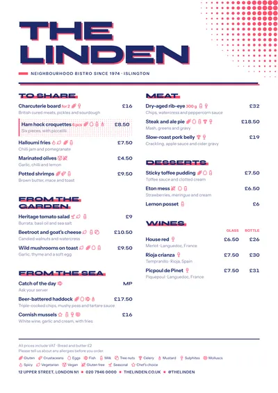
In screenprinting, each colour is printed through a different screen, and when they don’t line up perfectly the edge of the second colour peeks out. This style recreates that happy accident: the venue’s name, in very heavy Syne capitals, has a pink “ghost” behind it, slightly offset. Section titles repeat the trick with a block of colour shifted under the letters, and a pink bar accompanies the subtitle.
In the top right corner, a dot pattern that gets smaller and smaller recalls the halftones of a printed poster. Dishes are set in Instrument Sans, a clean sans serif, with prices in bold on the right. A featured dish has a fine frame and a bar in the accent colour.
The menu it suits
It works for venues with a clear graphic identity: speciality coffee shops, brunch spots, cocktail bars, bars with a young crowd. It suits mid-sized menus, with short section names that look good in capitals: “Coffee”, “Toast”, “Classics”, “Signatures”.
The offset effect stays in the headlines. Each dish’s description and price are crisp, so the menu reads just as well as a plain one.
Formats where it shines
- Two-column A4: the full layout, with the halftone in the corner.
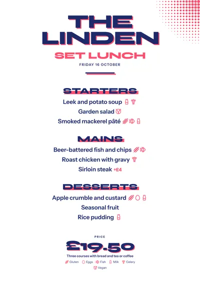
- 4:5 post or 9:16 story: the giant headline with its pink shadow looks great on a phone.
- A3 poster: for the window or the wall, like a gig poster.
The magic is in the colour pair. Navy and coral is the default, but green and orange or black and yellow work just as well.
Tips to get the most out of it
- Play with contrasting pairs of inks: navy and coral, green and orange, black and yellow. The effect depends on the second colour peeking out beside the first.
- Short venue names look best: the headline is in huge capitals and a long one takes up several lines.
- Keep section names brief (Coffee, Toast, Classics): they are set in capitals with their colour block.
- For social media, the daily menu’s 4:5 post makes great use of the big headline.
Colours, fonts, columns and format can all be changed in the editor without losing the design. It works on A4, US Letter, slim A4, A5, booklet, tri-fold, A3 and images for social media.
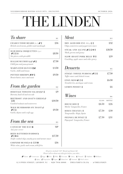 Milano
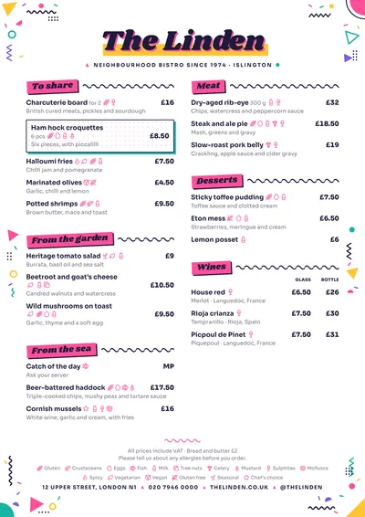 Memphis
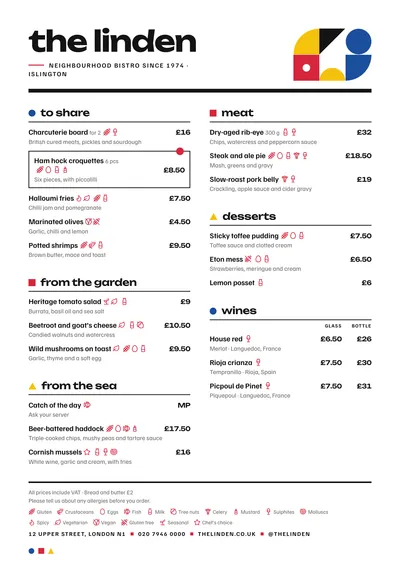 Bauhaus
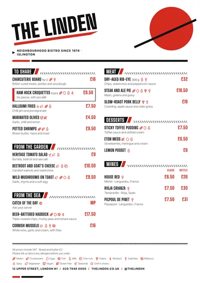 Constructivist