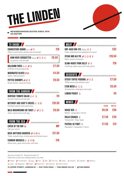
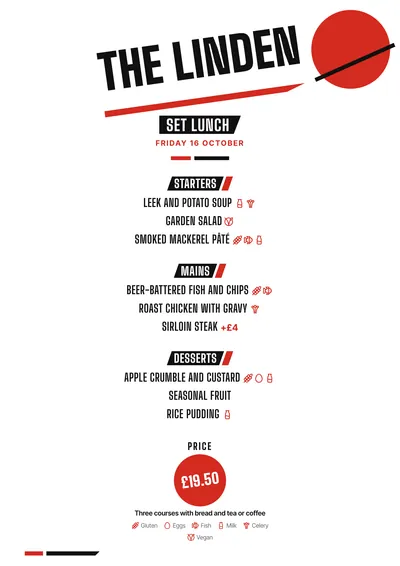
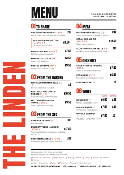
An avant-garde poster
Constructivist takes its cue from the posters of the 1920s Russian avant-garde. In the top right corner, a big red circle is crossed diagonally by a black bar. The venue’s name is set in Big Shoulders, a very heavy condensed face, in capitals, slanted and resting on a red stripe. A black triangle points to the subtitle.
Section titles sit on black oblique bands with a red wedge and diagonal hatching that runs to the edge of the column. Dishes stand upright, in condensed capitals, with descriptions in Inter Tight and prices in red. At the foot of each page there is a band with a red wedge and a black bar.
The menu it suits
Late-night bars, cocktail bars, modern bars and craft beer bars. Only the name is slanted: sections and dishes stand upright and read effortlessly. Go for short dish names, because condensed capitals gain strength with fewer words.
For a beer list, use price columns with headings (“Half”, “Pint”) and put the style and ABV in the description.
Formats where it shines
- Two-column A4: the full menu.
- A3 poster: the header works as a print for the wall.
- Daily menu and 4:5 post: the slanted name at the top, each course on its oblique band and the price inside a red circle.
If you want the same avant-garde spirit with softer shapes, compare it with Bauhaus. For a bar with more typography and less geometry, try Poster.
Tips to get the most out of it
- Short venue names look best: they are slanted and set in very heavy type, and a long one loses impact.
- Red and black are the style; if you change the accent, choose an equally strong colour.
- Dishes are set in condensed capitals: go for short names and one line of description.
- As an A3 poster, the header composition works as a print for the wall.
Colours, fonts, columns and format can all be changed in the editor without losing the design. It works on A4, US Letter, slim A4, A5, booklet, tri-fold, A3 and images for social media.
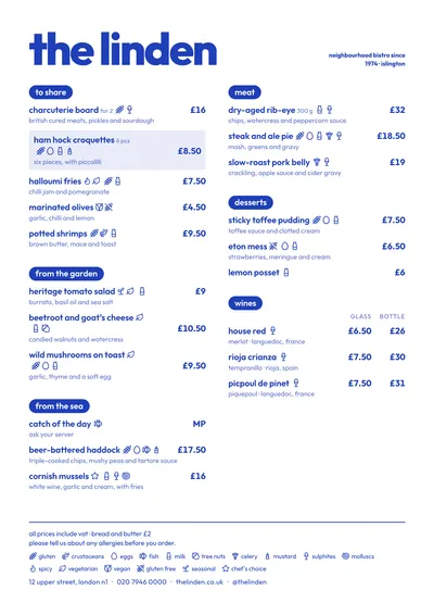 Riviera
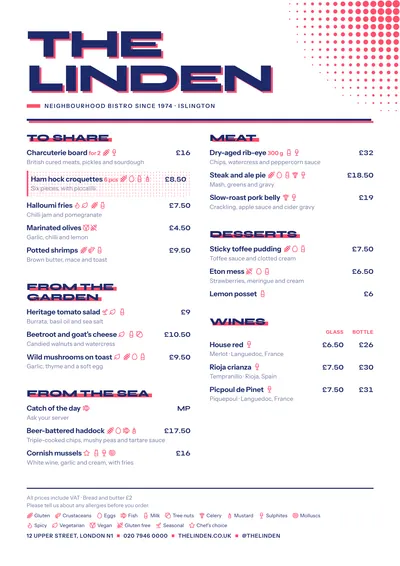 Screenprint
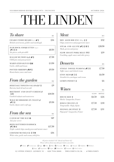
 Poster
 Milano