Circle, square and triangle
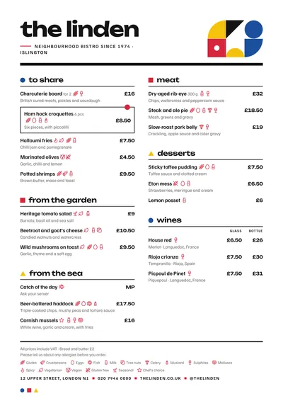
Bauhaus brings the 1920s German design school to your menu. The header is asymmetric: on the left, the venue’s name in lowercase in Unbounded, a wide, rounded typeface; on the right, a small composition of circle, square, triangle and quarter circles in red, blue and yellow. A thick black bar closes the header.
Section titles are lowercase, each with a coloured geometric marker in front. Dishes are set in Familjen Grotesk, a sans serif with character, strictly aligned left with prices on the right. A featured dish is boxed in with a red dot in the corner.
All lowercase
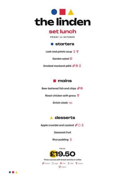
The Bauhaus argued for writing in lowercase only, and this style respects that: the name, the headings and the daily menu are all in lowercase. Bear that in mind if your brand is always written in capitals; if so, look at Swiss or Constructivist.
The menu it suits
Cafés, cocktail bars, design-led venues and museum cafés. Dishes written without frills: a name and one line of description. It works with mid-sized menus and clear sections; with lots of sections, the coloured markers repeat too often and lose their impact.
Formats where it shines
- Two-column A4: the full composition.
- A3 poster: the geometric header looks like a print on the wall.
- Daily menu and 4:5 post: the three shapes head the page and the price sits on a yellow circle.
Tips to get the most out of it
- Write dishes without frills: a name and one line of description. The style already provides the character.
- The red follows the accent colour; the blue and yellow of the shapes are fixed because they are purely decorative.
- The header composition looks great as an A3 poster.
- Everything is lowercase: bear that in mind if your brand is always written in capitals.
Colours, fonts, columns and format can all be changed in the editor without losing the design. It works on A4, US Letter, slim A4, A5, booklet, tri-fold, A3 and images for social media.
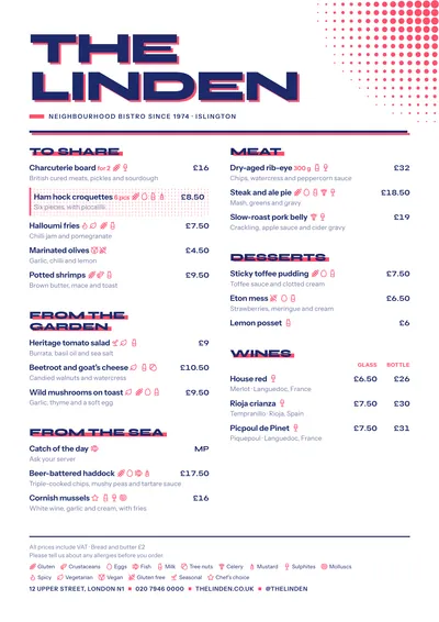 Screenprint
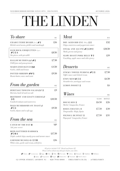 Milano
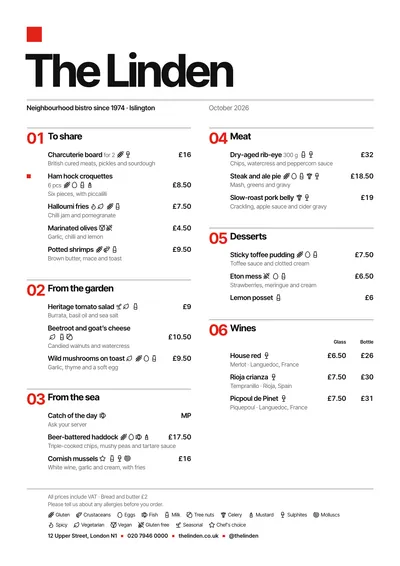 Swiss
Swiss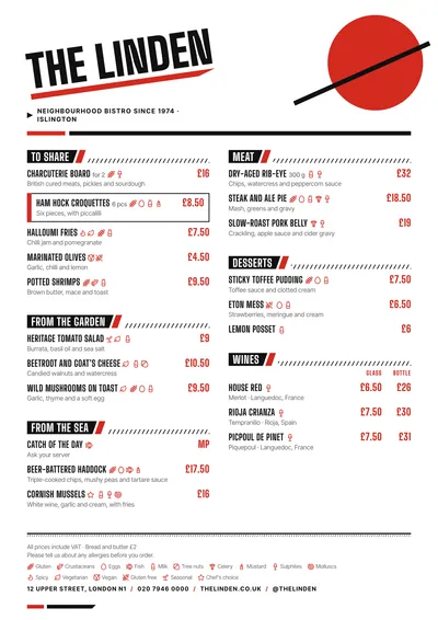 Constructivist