A grid, ranged left
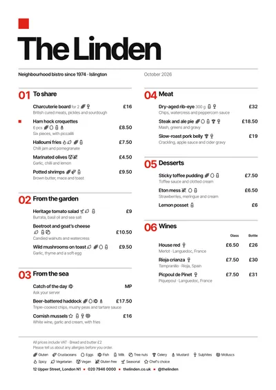
Swiss applies the International Typographic Style, the style of 1950s and 1960s Swiss posters, to your menu. There is a single ornament: a red square in the top left corner. Below it, the venue’s name in bold Inter Tight, huge and tightly letter-spaced. The subtitle and the month are spread out under a fine rule.
Each section has a big red number (01, 02, 03…) in a column hanging on the left, and the dishes line up on the grid to its right. Everything is ranged left, with fine rules and prices in tabular figures aligned right. A featured dish is marked with a small red square in the margin.
The menu it suits
Modern restaurants, cafés, design-led venues and cafés in museums or arts centres. It works with clear sections and short dish names, without adjectives. The section numbers help guests find their way around medium or long menus, and tabular figures keep the price columns immaculate.
Formats where it shines
- Two-column A4: the full grid.
- A3 poster: here it becomes a real Swiss poster.
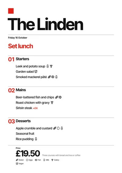
- Daily menu and 4:5 post: aligned left, with the title in red, each course numbered and the price large with what it includes beside it.
If you want the same order with a softer tone, compare it with Nordic. For something more graphic, with circle, square and triangle, look at Bauhaus.
Tips to get the most out of it
- Don’t add ornaments: the red square is the only one, and the style depends on it staying that way.
- Write clear dish names without adjectives; here the information is in charge.
- If you change the red, choose another strong colour, such as blue or orange: the square and the numbers follow it.
- It is one of the few styles with a left-aligned daily menu: it looks great as a social post.
Colours, fonts, columns and format can all be changed in the editor without losing the design. It works on A4, US Letter, slim A4, A5, booklet, tri-fold, A3 and images for social media.
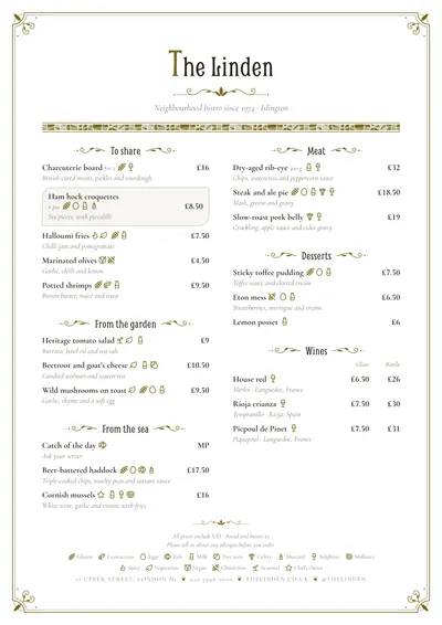
 Brasserie
 Editorial
 Modernista
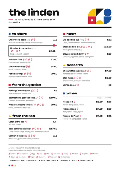 Bauhaus