A grand café on paper
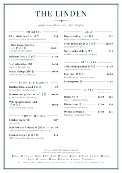
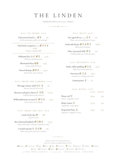
Brasserie takes its cue from the great Parisian cafés and the classic cafés of any city. The whole page is framed by a fine double rule. The name is set in Playfair Display, in spaced capitals and bottle green; beneath it sit a small diamond ornament between rules and the subtitle in italics.
Sections open with the title in small caps between double rules. The most distinctive touch is in the dishes: a fine line leads each name to its price, like the dot leaders on traditional menus, only cleaner. The text is set in Source Serif, a comfortable reading serif, with descriptions in italics.
Long menus that stay in order
It is one of the styles that copes best with a long menu. The line to the price lets guests follow each row across two dense columns, and the rules separate the sections without any blocks of colour. It suits café-restaurant menus that cover the whole day (breakfast, dishes of the day, market cooking, desserts, wines) and brasseries serving the classics.
Glass and bottle columns line up under their headings, and a featured dish is marked with a fine-rule box.
Formats where it shines
- Two-column A4: the full menu on one page.
- Booklet: for long menus with wines, with a front and back cover.
- A3 poster: at the entrance, framed by its double rule.
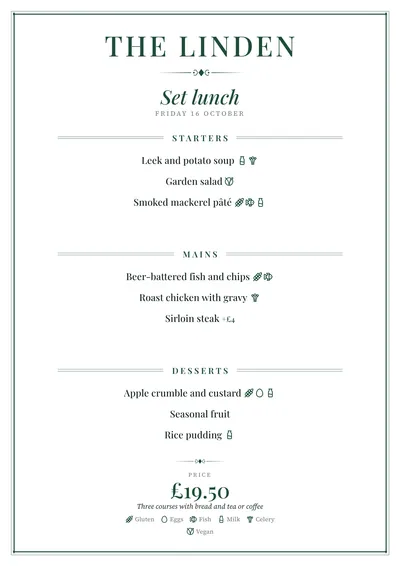
- Daily menu: the title in green italics and each dish centred under its heading.
If you want the same order with more of a fine dining feel, compare it with Sobremesa. For a wine list with glass and bottle columns, try Bodega.
Tips to get the most out of it
- It copes with long menus: the line to the price lets guests follow each row even across two dense columns.
- Bottle green is the house colour; if you change it, try burgundy or midnight blue before anything bright.
- For a café serving breakfast, lunch and afternoon tea, a booklet gives you room to separate each part of the day.
- Use the bilingual version if you get a lot of tourists: the translation sits discreetly under each dish.
Colours, fonts, columns and format can all be changed in the editor without losing the design. It works on A4, US Letter, slim A4, A5, booklet, tri-fold, A3 and images for social media.
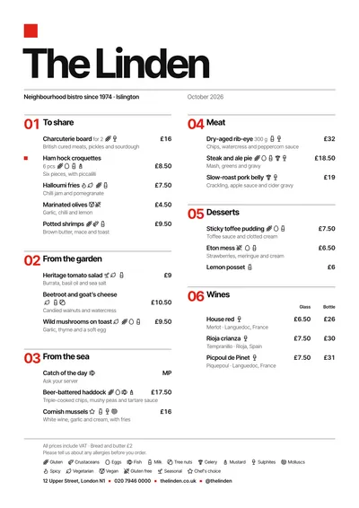 Swiss
Swiss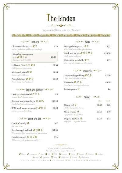 Modernista
 Sobremesa
 Editorial