Lots of air and few things
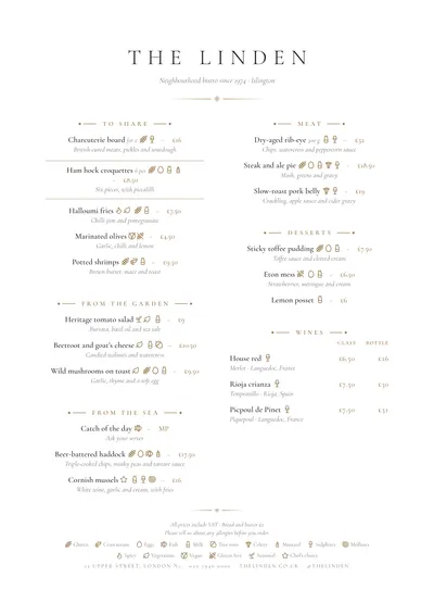
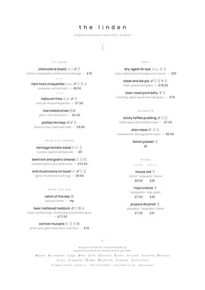
Sobremesa arranges the whole page around a central axis. The venue’s name is set in widely spaced capitals; beneath it, a subtitle in italics and a small gold diamond between two fine rules. Each section opens with its title in gold small caps, flanked by lines ending in a dot. Dishes are centred underneath, with the description in italics and the price after the name, small, in the gold accent and separated by a dash.
Everything is set in Cormorant Garamond, a fine, high-contrast roman. Because it needs size, the style starts from larger type than most so it doesn’t get lost on the table.
The menu it suits
It is a style for short, carefully curated menus: a seasonal menu with four or five sections, a tasting menu, a dessert menu or a hotel restaurant’s menu. Because the price follows the dish rather than sitting in a column, reading starts with the food, which is exactly what you want in fine dining.
It supports glass and bottle columns for a wine selection, but if your menu runs on small plates, halves and full portions, a bar style such as Counter will keep things more orderly.
Formats where it shines
- Slim A4 (140 × 297 mm): a single narrow, centred column, very much a restaurant look.
- Booklet: a cover with the name and room for each section to breathe.
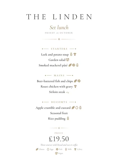
- A5: for the daily menu, with the title in gold italics, the date in capitals and the price large at the bottom.
If you change the gold, look for muted tones: bronze, olive green, burgundy. A bright colour breaks the calm of the whole.
Tips to get the most out of it
- The shorter the menu, the better it looks: with fifteen or twenty dishes the centred layout can breathe.
- Write one-line descriptions. In centred italics, three-line ones become heavy.
- If you change the accent, look for muted tones (bronze, olive green, burgundy): a loud colour breaks the calm of the style.
- For long menus, switch to a booklet instead of squeezing everything into two columns.
Colours, fonts, columns and format can all be changed in the editor without losing the design. It works on A4, US Letter, slim A4, A5, booklet, tri-fold, A3 and images for social media.
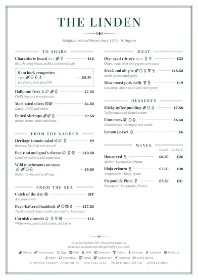 Brasserie
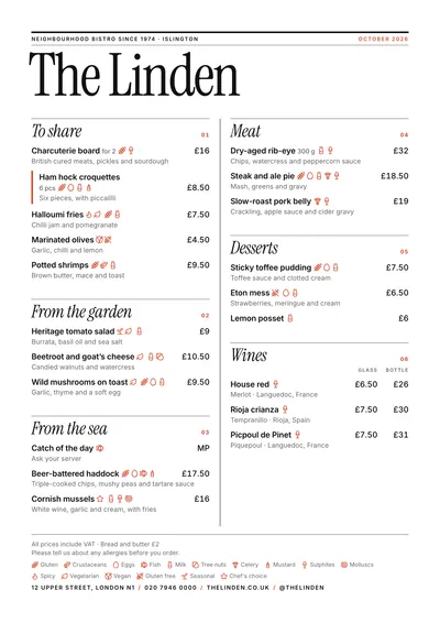 Editorial
 Signature
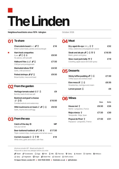 Swiss
Swiss