Almost nothing on the page
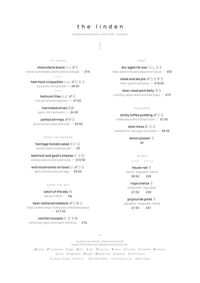
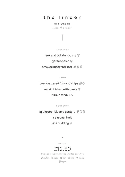
Signature strips the menu back to the bare minimum. Everything is lowercase, set in Manrope, a clean geometric sans serif, at a small size. The venue’s name is widely letter-spaced; beneath it sit a tiny subtitle and a thin vertical line that drops down towards the dishes.
Section titles are small, spaced-out grey small caps, almost a whisper. Dishes are centred, with the description underneath and the price at the end after a long dash, with no columns. At the foot of the page, a single dot marks the end of the menu.
The menu it suits
Fine dining restaurants, tasting menus and chef-led kitchens with a short menu. Write your dishes the way that world writes them: the main ingredient and two or three elements, no adjectives. The shorter the menu, the better it looks: the type grows when there are only a few dishes, and the white space does the rest.
With a forty-dish menu the style loses its focus. For that, there are options with more structure, such as Brasserie, or with the same spirit and more presence, such as Sumi.
Formats where it shines
- Slim A4 (140 × 297 mm): one centred column, tall and narrow.
- A4: with generous margins all round.
- Booklet: with a cover, for slightly longer menus that keep their breathing room.
- Daily menu on A5: each dish on its own line and the price at the bottom.
Small type is no excuse to skip the essentials: allergens sit next to each dish as discreet icons or numbers, with a key at the bottom of the page.
Tips to get the most out of it
- It works with short menus: a tasting menu or a list of fifteen dishes.
- Write dishes the way chefs do: the main ingredient plus two or three elements (“tomato, strawberry, basil”).
- If the dining room is dimly lit, swap the grey accent for a darker one to gain contrast.
- Print it on heavy paper: the design is so restrained that the paper shows.
Colours, fonts, columns and format can all be changed in the editor without losing the design. It works on A4, US Letter, slim A4, A5, booklet, tri-fold, A3 and images for social media.
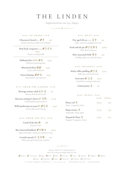 Sobremesa
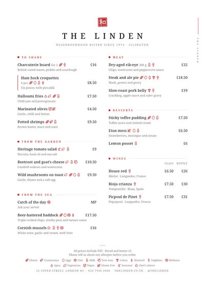 Sumi
Sumi