Black, white and condensed type
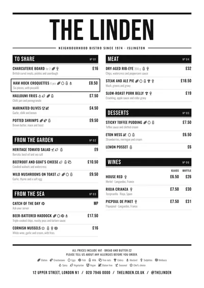
Counter is the bar menu at its most direct. The name is set in Bebas Neue, a tall condensed capital, at a huge size under a heavy rule. The subtitle, in spaced-out capitals, sits between thin rules.
Each section opens with a black band across the full column width, with the heading in white on the left and its number on the right (“No. 01”). Dishes are set in Oswald, another condensed face, in capitals, with the description in lowercase underneath and the price in bold. A featured dish is marked with a light grey band.
For menus with lots of prices
The condensed type leaves room for three price columns, so it is the ideal style for small plates, halves and full portions. Each section carries its column headings on top and a dash where a size does not exist. It copes with long menus: bar snacks, fried plates, sharing plates, sandwiches, sliders and drinks.
Say how big a portion is when it helps (“8 pcs”, “to share”): it appears in small type next to the name.
Formats where it shines
- Two-column A4: the table menu, in a sleeve.
- A3 poster: behind the bar, with every price in view.
- 16:9 screen: for the TV in the bar.
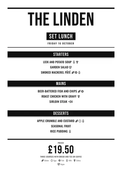
- Daily menu: the title in a black band and the price large at the bottom.
It is the style behind the bar menu template. If you want something with more colour, compare it with Riviera or Poster.
Tips to get the most out of it
- Group dishes into a few well-chosen sections: each one opens with a black band and, if there are too many, the page gets heavy.
- For small, half and full portions use three price columns with headings: the condensed type leaves plenty of room.
- It works with a single ink: if you swap the black for navy or a dark burgundy, bands and text change together.
- As an A3 poster behind the bar it reads from across the room.
Colours, fonts, columns and format can all be changed in the editor without losing the design. It works on A4, US Letter, slim A4, A5, booklet, tri-fold, A3 and images for social media.
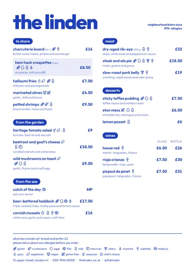 Riviera
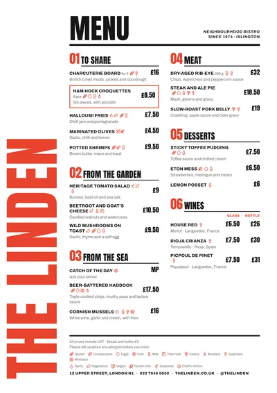 Poster
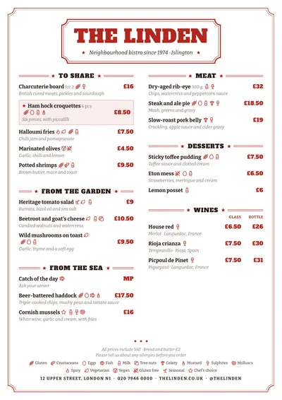 Vermouth
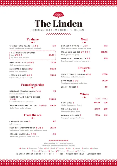 Feria
Feria