One ink, plenty of character
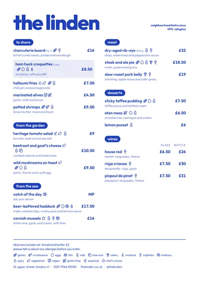
Riviera works with a single colour: the same blue for the venue’s name, the dishes, the prices and the ornaments. There is no second colour and no greys; the hierarchy comes from weight and size. The name is huge and lowercase in Outfit, a geometric typeface with rounded shapes. Dishes are set in bold and descriptions in regular, a little smaller.
Section titles are filled pills with the text knocked out in white. They are the only blocks of solid colour on the page and they work like tabs: the eye jumps from one to the next without reading anything else. A featured dish sits on a heavily tinted version of the same blue.
The menu it suits
This is a style for bars and modern gastropubs: short sections, dishes with plain names and clear prices. Prices are aligned right, in bold and without dot leaders, so they are quick to find without dominating the page. The glass and bottle columns on a wine list line up under their headings. A menu of thirty or forty dishes across two columns still looks tidy, because the type size adjusts itself to fill the page.
The tone is informal. If your cooking calls for white tablecloths and unhurried service, lowercase may lack a little ceremony; in that case, look at Sobremesa or Brasserie.
Formats where it shines
- Two-column A4: the original layout, for a menu sleeve or clipboard.
- A3 poster: the pills stand out from across the room; a good choice for the wall behind the bar.
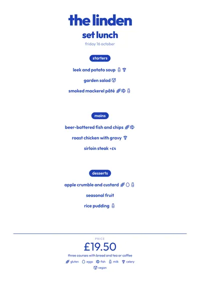
- Daily menu on A5 or as a social post: everything is centred, the dishes sit under their pills and the price comes out large at the bottom.
Because everything depends on one colour, changing it changes the whole menu: in bottle green or burgundy it looks like a different place.
Tips to get the most out of it
- Pick an ink with some punch (cobalt blue, bottle green, burgundy): with only one colour, the colour is your identity.
- Avoid light inks such as yellow or pale pink: the thin lowercase descriptions become hard to read.
- Highlight one dish per section at most: the pale blue background behind a featured dish works best the less you use it.
- The style sets everything in lowercase, including your venue’s name. If your brand always appears in capitals, look at Poster or Counter.
Colours, fonts, columns and format can all be changed in the editor without losing the design. It works on A4, US Letter, slim A4, A5, booklet, tri-fold, A3 and images for social media.
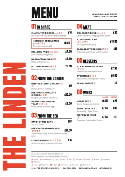 Poster
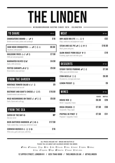 Counter
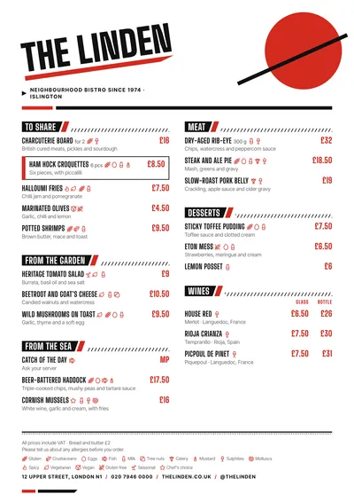 Constructivist
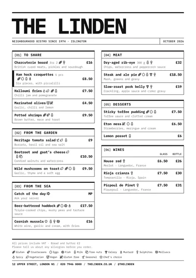 Raw
Raw