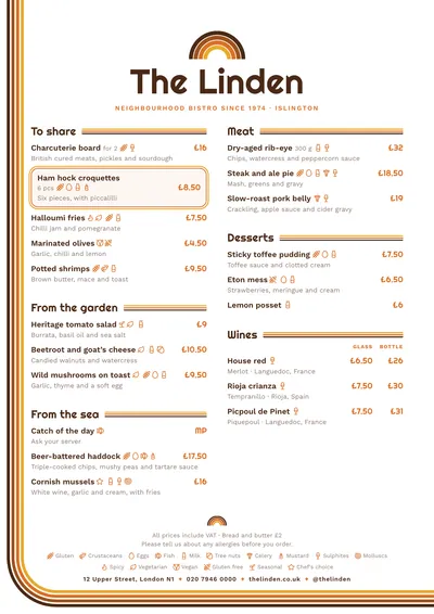
Rainbows, stripes and curves
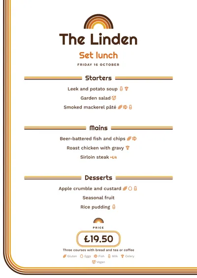
Seventies looks back to the signs and packaging of the 1970s: parallel stripes, sweeping curves and toasted colours. Above the name there is an arched four-stripe rainbow: mustard, orange, rust and brown. A band with the same four stripes runs down the left margin and, when it reaches the bottom, turns in a wide curve and runs along the foot of the page.
The name is set in Righteous, a geometric, rounded typeface very much of its era, in brown. Section titles are followed by a rule of three thin stripes. Dishes are set in Work Sans, with prices in orange Righteous. A featured dish has a double frame with rounded corners, orange inside and mustard outside.
The menu it suits
Retro brunch spots, pizzerias, burger joints, neighbourhood bars spinning vinyl and vintage cafés. It suits menus with personality and fun dish names, and works in two columns or just one. The dishes area stays white: the colour is concentrated in the arch, the band and the rules.
If you like retro but from another decade, compare it with Diner, from the 1950s, or Memphis, from the 1980s.
Formats where it shines
- Two-column A4: the full menu, with the band framing the page.
- Slim A4 or A5: in one column, for the table.
- 16:9 screen: with a small arch above the name.
- Daily menu and social post: centred, with the price in its double frame.
Tips to get the most out of it
- Choose a warm accent (orange, rust) and a dark ink (brown, olive green): the stripes are drawn from both.
- The band runs almost to the edge of the page: if your printer leaves a margin, print it at a print shop so it comes out in full.
- For pizzas in medium and large, or beers in halves and pints, use price columns: they line up under their headings.
- Highlight the house speciality: it gets a rounded double frame in orange and mustard.
Colours, fonts, columns and format can all be changed in the editor without losing the design. It works on A4, US Letter, slim A4, A5, booklet, tri-fold, A3 and images for social media.
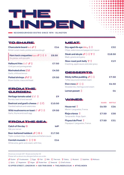 Screenprint
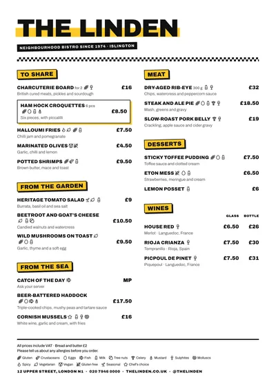 Block
Block Brunch
 Trattoria