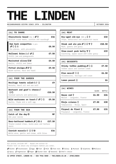
Heavy rules and boxes
Raw is a brutalist menu: everything is set in IBM Plex Mono, a technical-looking monospaced face, black on white, without a single ornament. At the top, a heavy rule and the venue’s name, huge, in capitals and tightly spaced. Below it, a row of details split into cells: the subtitle on the left and the month on the right, separated by a vertical rule.
Each section is a box with a heavy top border and a header carrying its index in square brackets, [01], and the title in capitals. Inside, each dish is a table row separated by a fine rule, with the name in bold, the description underneath and the price aligned right. A featured dish has a thick black bar on its left side. At the foot, another heavy rule, the allergen key and the contact details separated by bars.
The menu it suits
Speciality coffee shops, urban bars, craft beer bars, natural wine bars and design-led venues. It is a very structured menu: the boxes separate the sections without any colour and the rows mean every price can be found instantly. It suits short menus with direct names (“Flat white”, “Avocado toast”), where the monospaced type shines.
If you like monospaced type but want a warmer feel, compare it with Ticket. For an equally strict order with a sans serif and a touch of red, look at Swiss.
Formats where it shines
- Two-column A4: the original layout, for the table or the wall.
- Slim A4 or A5: in one column, the boxes stack up like a list.
- 16:9 screen: readable from the bar, with the boxes in three columns.
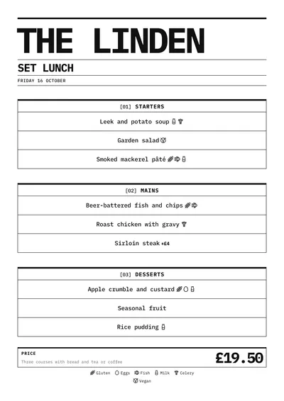
- Daily and weekly menus: each course or each day in its own box, and the price in the last box.
Tips to get the most out of it
- Keep dish names short and direct: in a monospaced face every letter takes the same space, so long names wrap sooner.
- Venue names of one or two words gain strength: the name is set in capitals and very large.
- It works in pure black, but you can swap the ink for an ink blue or a very dark green without losing the character.
- Use price columns for sizes (cup, mug) or measures (half, pint): the headings sit in the box header.
Colours, fonts, columns and format can all be changed in the editor without losing the design. It works on A4, US Letter, slim A4, A5, booklet, tri-fold, A3 and images for social media.
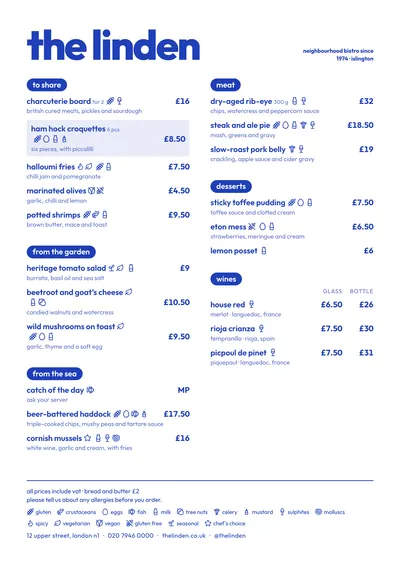 Riviera
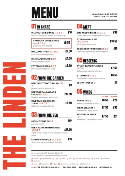 Poster
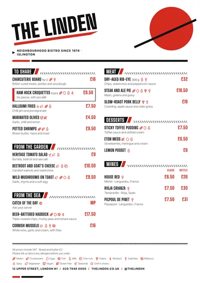 Constructivist
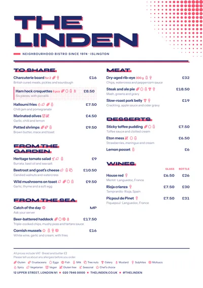 Screenprint