A roadside diner
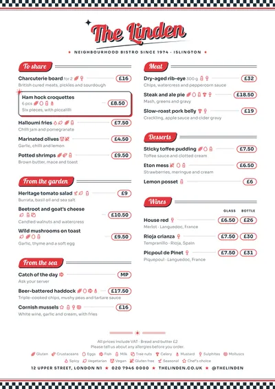
Diner takes its cue from 1950s American diners. At the top and bottom runs a black and white chequerboard border with a red rule. The venue’s name is set in Lobster, a heavy script, in red and slightly slanted, with a sign-writer’s shadow, an underline swash and sparkles on either side.
Sections sit on slanted red boomerang-shaped badges trailing three parallel lines. Dishes are set in Sora, a geometric sans serif, and prices sit inside round-edged pills, joined to the dish by a leader line. A featured dish has an atomic star in the corner.
The menu it suits
Burger joints, breakfast and pancake places, milkshake bars and American-style diners. Organise the menu as a diner would: breakfast, burgers, sandwiches, sides, shakes. If you have two prices (on its own or as a meal, regular or large), use price columns with headings and each figure gets its own pill.
Playful dish names work well here, but explain underneath what goes into each one: “Double patty, cheddar, bacon and griddled onions”.
Formats where it shines
- Two-column A4: the table menu.
- 16:9 screen: above the counter, with the chequerboard and the badges.
- 4:5 post: to announce the daily menu.
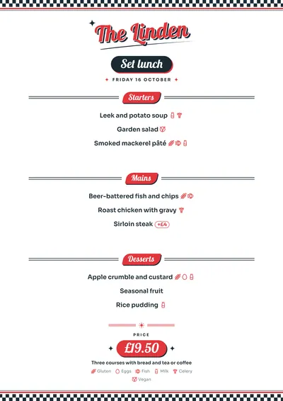
- Daily menu: the title on a dark badge, each course on its red badge and the price in a pill with stars.
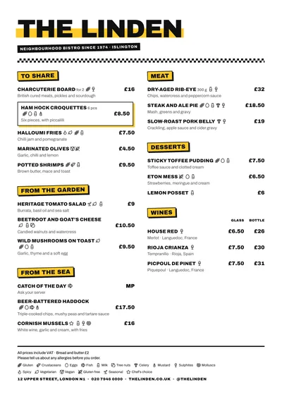
For a more urban burger joint without the retro wink, compare it with Block.
Tips to get the most out of it
- If your venue has a playful or punning name, the script lettering shows it off; long names wrap onto two lines.
- Organise the menu like a diner: breakfast, burgers, sandwiches, sides, shakes.
- Prices sit in pills, so they read best with short figures; leave “VAT included” (or “plus tax” in the US) for the footer note.
- For the screen above the counter, the 16:9 version keeps the chequerboard and the badges.
Colours, fonts, columns and format can all be changed in the editor without losing the design. It works on A4, US Letter, slim A4, A5, booklet, tri-fold, A3 and images for social media.
 Block
Block Brunch
 Taquería
 Market