Soft and friendly
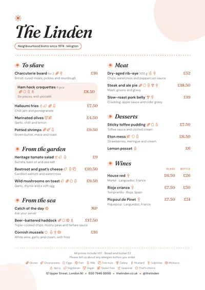
Brunch is the friendliest style in the collection. The name is set in Fraunces italic, a serif with soft shapes, with a little hand-drawn sun above it. The subtitle sits inside a thin-bordered capsule. Rounded splashes of very pale peach peep out from the corners of the page, adding warmth without covering the paper.
Section titles use the same italic, each preceded by a dot with a halo, like a tiny sun. Dishes are set in DM Sans, a clear sans serif, and prices in a serif, in the terracotta accent. A featured dish sits on a peach background with rounded corners, and a dotted line separates the footer.
The menu it suits
Breakfasts, toast, eggs, pastries, coffees, juices and something sweet. A café or brunch menu with five or six sections looks great across two columns, and the type size adjusts itself to fill the page. If your coffees come in sizes or with different milks, use price columns with headings.
Mark vegan, vegetarian and gluten-free dishes with their icons: on a brunch menu that is the first thing people look for, and it is explained in the key at the bottom alongside the allergens.
Formats where it shines
- Two-column A4: the full menu on the table.
- A3 poster: behind the counter, so people can choose while they queue.
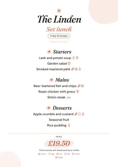
- Daily menu on A5 or a 4:5 post: the title in italics, the date in a capsule and the price on a soft splash of colour.
More ideas for organising breakfasts, coffees and pastries in the café menu guide.
Tips to get the most out of it
- Earthy tones suit it: terracotta, mustard, sage green. Avoid cold or very dark accents.
- Say in the description what each combo includes (eggs, toast, juice) and let the price stand alone.
- If breakfast is served at set times, put them in the section note (“9am to 12.30pm”).
- If you upload your logo, it replaces the sun above the name.
Colours, fonts, columns and format can all be changed in the editor without losing the design. It works on A4, US Letter, slim A4, A5, booklet, tri-fold, A3 and images for social media.
 Bakehouse
 Screenprint
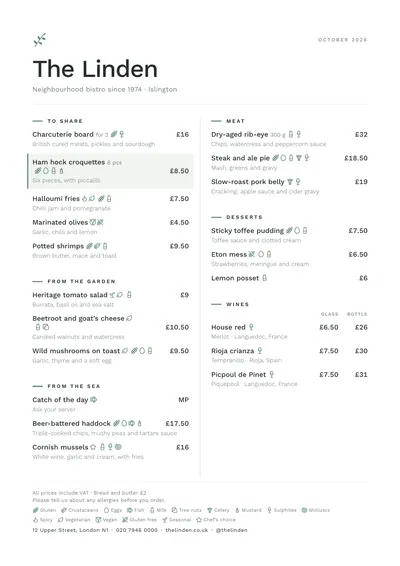 Nordic
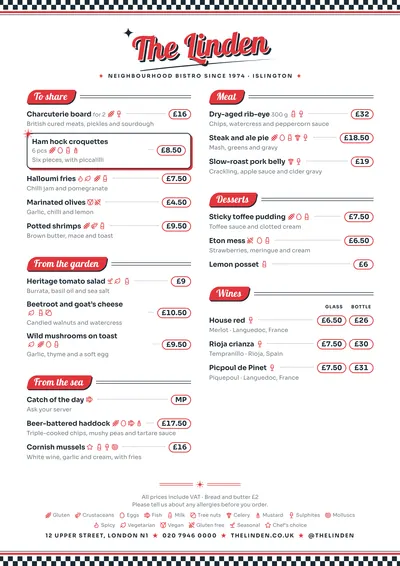 Diner
Diner