Stripes, anchor and waves
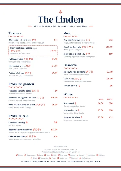
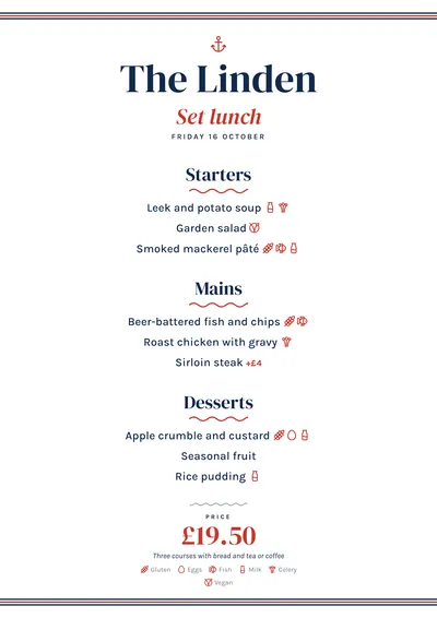
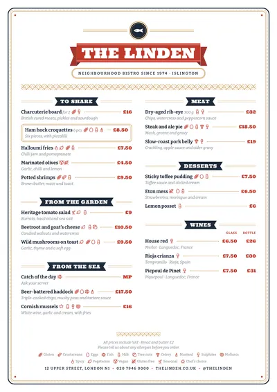
Mariner uses few ornaments, all from the same world. At the top and bottom of the page runs a band of thin navy and red stripes, like the edge of a Breton shirt. Above the name sits a small red anchor. The name is set in DM Serif Display, a high-contrast serif with plenty of presence, and the subtitle in spaced capitals between two rules.
Each section has its title in the same serif with a red wave drawn underneath. Dishes are set in Karla, a simple sans serif, and prices in red serif, aligned right. A featured dish is boxed in with a dashed, round-cornered frame, perfect for the catch of the day.
A fish and seafood menu
Seafood menus have their quirks: produce by weight, market prices, half portions, rice dishes per person. Mariner handles them without tricks. “65/kg” or “MP” go in the price and line up like any other figure, and price columns (half and full, glass and bottle) carry their heading at the top of each section. For whatever changes daily, use the section note.
The 14 allergens sit next to each dish, as icons, numbers or by name. In a seafood restaurant, fish, crustaceans and molluscs turn up on almost every line.
Formats where it shines
- Two-column A4: the full menu, from the starters to the white wines.
- A3 poster: at the entrance, with the catch of the day highlighted.
- A5 or 4:5 post: for the daily menu.
To build the menu step by step, see the seafood menu guide.
Tips to get the most out of it
- Produce sold by weight or at market price goes in the price as it is (65/kg, MP) and lines up like any other figure.
- For the catch of the day, add a note to the section: “Ask your server about today’s fish”.
- Keep a dark blue ink: the stripes combine the ink with the accent and need a navy base.
- If you upload your logo, it takes the anchor’s place above the name.
Colours, fonts, columns and format can all be changed in the editor without losing the design. It works on A4, US Letter, slim A4, A5, booklet, tri-fold, A3 and images for social media.
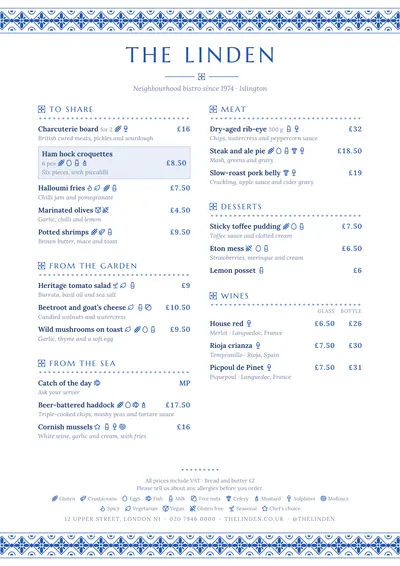 Azulejo
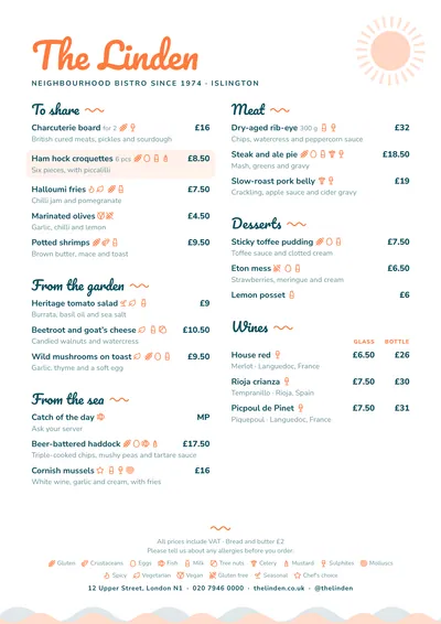 Beach Bar
 Market
 Tinned