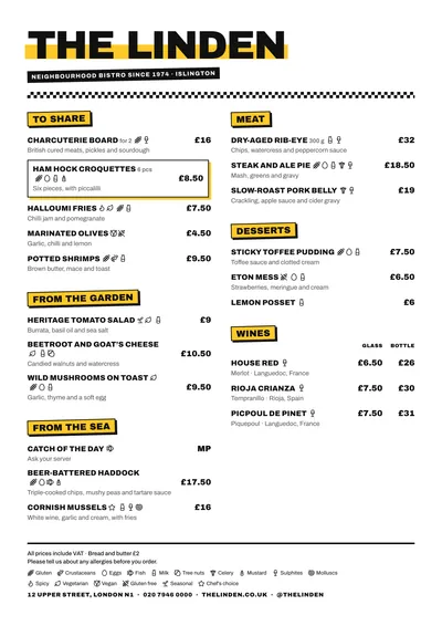
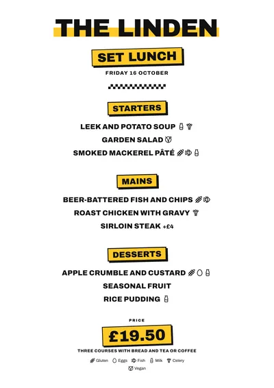
Marker pen, chequers and stickers
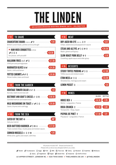
Block is built with Archivo Black, a very heavy sans serif, and Archivo for the text. The venue’s name is in capitals over a yellow marker stroke, as if you had underlined it by hand. Below it come a black strip with the subtitle in white and a chequered border, like a racing flag.
Section titles look like stickers: yellow rectangles with a thick black border and an offset shadow. Dishes are in black capitals, with the description in lowercase underneath and the price in bold on the right. A featured dish is boxed in with a yellow border.
A menu for ordering fast
In a burger joint people order standing up, at the counter, or with the menu in one hand and a phone in the other. Block is designed for that: clear sections, names in capitals that read in one go and a single line of ingredients. If you have two prices, such as a burger on its own and as a meal, use price columns with their heading at the top.
Mark vegan, spicy or gluten-free with their icons: they appear next to the dish and are explained in the key at the bottom, alongside the allergens.
Formats where it shines
- A4: for tables, the counter or a menu sleeve.
- A3 poster: by the till, with the whole menu in view.
- 16:9 screen: for the TV in your venue; the yellow stickers stand out from a distance.
- 4:5 post: to announce the daily menu or something new.
More ideas for organising it in the burger menu guide.
Tips to get the most out of it
- If your brand has its own colour (red, orange, lime green), set it as the accent: the marker stroke and the stickers follow it.
- Keep sections few and clear: burgers, starters, to share, drinks. The stickers look better when there aren’t twenty of them.
- Put the quantity next to the name (180 g, 6 pcs): it appears in small type beside the dish and saves questions.
- For a burger on its own and as a meal, use two price columns with their headings at the top of the section.
Colours, fonts, columns and format can all be changed in the editor without losing the design. It works on A4, US Letter, slim A4, A5, booklet, tri-fold, A3 and images for social media.
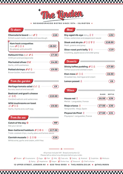 Diner
Diner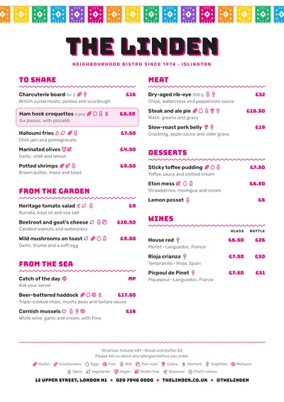 Taquería
 Market
 Memphis