Sun, waves and sign-writer lettering
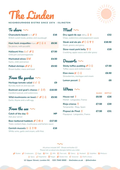
Beach Bar smells of summer. The venue’s name is set in Pacifico, a lively surf-shop script, in orange. A sun with its rays peeps out of the top right corner in a very pale tone, and gentle waves run along the foot of each page.
Section titles use the same lettering, in dark teal, with a small orange wave beside them. Dishes are set in Nunito Sans, rounded and legible, and prices in bold. A featured dish sits on a peach-coloured band.
The menu it suits
Beach bars, summer terraces, ice cream parlours, pool bars and beach clubs. Menus of sharing plates, fried fish, salads, sandwiches and drinks. It suits clearly named sections and one-line descriptions: people read it standing up, in the sun and in a hurry.
If you do rice dishes or paella to order, put the conditions (per person, minimum two, waiting time) in the section note rather than on every dish.
Formats where it shines
- Two-column A4: the table menu.
- A3 poster: at the entrance, with plates and prices.
- 4:5 post or 9:16 story: to announce the dish of the day on social media.
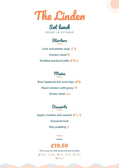
- Daily menu: the title in Pacifico, a wave under each heading and the price in orange.
With another pair of colours (blue and yellow, aqua and coral) it moves to a different beach. If your place is by the sea but more classic, compare it with Mariner.
Tips to get the most out of it
- If you get a lot of tourists, use the bilingual version: the translation sits under each dish and next to each heading.
- If your drinks list is long (cocktails, slushies, beers), make it a separate menu in the same style.
- On the beach menus get wet: laminate them or use sleeves.
- The colours are light and use little ink; the sun and the waves follow the ink and the accent.
Colours, fonts, columns and format can all be changed in the editor without losing the design. It works on A4, US Letter, slim A4, A5, booklet, tri-fold, A3 and images for social media.
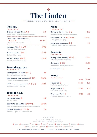 Mariner
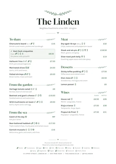 Botanical
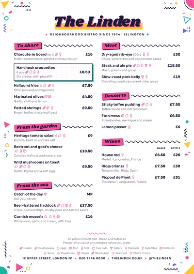 Memphis
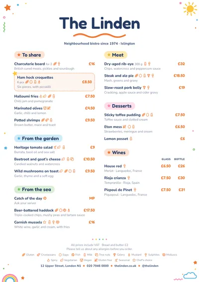 Playtime