Coloured pencils and doodles
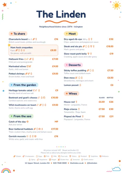
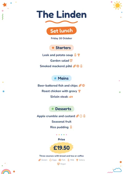
Playtime is designed so anyone can read it, including a child who is just starting to read. The name is set in Fredoka, a typeface with rounded, friendly shapes, in navy with a wavy orange underline that looks drawn in crayon. On the first page a little sun peeps out at the top right; in the other corners there are stars, dots, a squiggle, a small rainbow and a cloud, always in the margin.
Each section title sits in a coloured pill with a little star in front: orange, blue, green, yellow and pink, like a box of pencils. Dishes are set in bold Nunito Sans, very legible, and prices in orange Fredoka. A featured dish appears on a card with a stitched border and a star sticker.
The menu it suits
School canteens, nurseries, restaurant kids’ menus, family restaurants, soft play cafés and ice cream parlours. It really shines on the weekly menu: on landscape A4, each day takes its own coloured card, with the dishes centred and allergens alongside, ready to pin on the noticeboard or send to families.
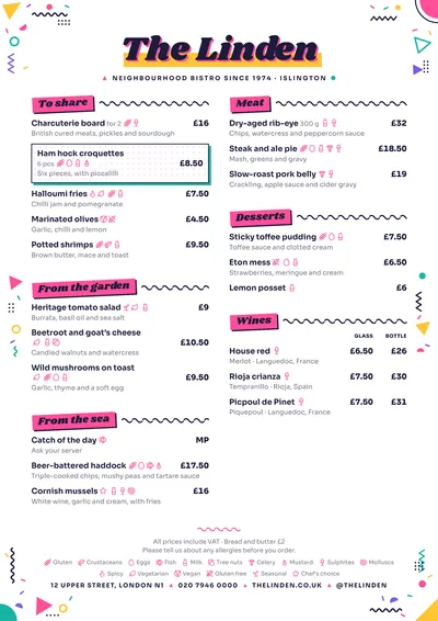
If you prefer more of an exercise-book feel, look at Notebook; for something more pop and full of confetti, try Memphis.
Formats where it shines
- Landscape A4: the canteen’s weekly menu, one day per column.
- A5 or A4: the centred kids’ menu, with the price on its sticker.
- Two-column A4: the menu of an ice cream parlour or a family restaurant.
- Social post: the week’s menu for the parents’ group chat.
Tips to get the most out of it
- For a school canteen choose the weekly menu on landscape A4: each day gets its own card and its own colour.
- Mark allergens on every dish: on a school menu it is the first thing families look at.
- Short, clear dish names (roast chicken, vegetable lasagne) work better than long descriptions.
- The doodles in the corners have fixed colours; the big star, the prices and the menu label follow the accent.
Colours, fonts, columns and format can all be changed in the editor without losing the design. It works on A4, US Letter, slim A4, A5, booklet, tri-fold, A3 and images for social media.
 Beach Bar
 Memphis