Organic shapes and little leaves
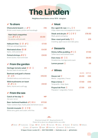
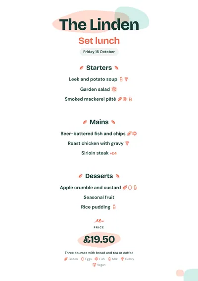
Poké takes its cue from bowls: fresh colours, rounded shapes and plenty of space. The name is set in Bricolage Grotesque, a heavy grotesque with character, tightly spaced and in deep green. Behind it, two overlapping organic shapes: one coral, taken from the accent, and one mint, taken from the ink. On the following pages, just a couple of small shapes in the bottom corner.
Each section has a little coral leaf with its vein in front of it. Dishes are set in DM Sans, clean and rounded, with prices in bold coral. Vegan, spicy or gluten-free labels are not left loose: each icon sits inside a softly coloured round badge. A featured dish is a very light coral card with asymmetric corners.
The menu it suits
Poké bars, bowls and salads, healthy and vegan food, juice and smoothie bars, and healthy brunch. It suits menus built in steps or around bases, with short names and one line of ingredients. Prices are quick to find without dot leaders, and size columns line up neatly.
If you want a more plant-like feel, with drawn branches, look at Botanical; for something more restrained and calm, try Nordic.
Formats where it shines
- Two-column A4: the full menu, with the shapes behind the name.
- Slim A4 or A5: in one column, for the table or the counter.
- 16:9 screen: above the ordering point, with prices clearly visible.
- 4:5 post: the bowl of the week or the daily menu for social media.
Tips to get the most out of it
- Mark vegan, gluten-free or spicy on each dish: the labels appear in round badges next to the name.
- For a “build your own bowl”, use one section per step (base, protein, toppings, sauce) and price columns for the sizes.
- The shapes are very light tints of the accent and the ink: if you swap the coral for another colour, the shape follows it.
- It works best with one-line descriptions that list the main ingredients.
Colours, fonts, columns and format can all be changed in the editor without losing the design. It works on A4, US Letter, slim A4, A5, booklet, tri-fold, A3 and images for social media.
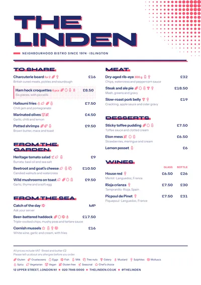 Screenprint
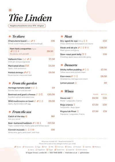 Brunch
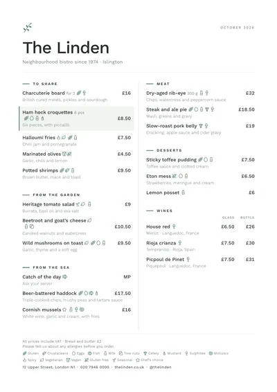 Nordic
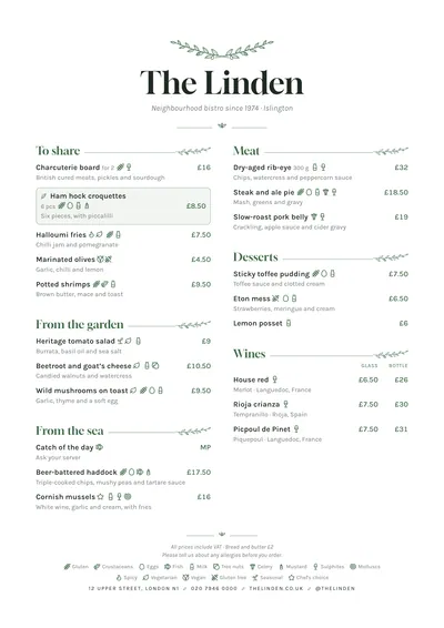 Botanical