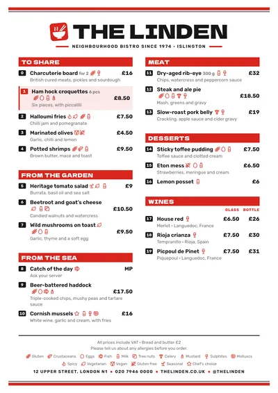
Red bars and numbered dishes
Wok takes the best of the order-by-number menus of neighbourhood Asian restaurants without dressing up in costume: no fake-oriental lettering, no dragons. At the top and bottom of the page runs a red band with a black rule. The name is set in Dela Gothic One, a very black, wide typeface, in capitals, with a red stamp on the left showing a cut-out steaming bowl and chopsticks.
Each section opens with a red bar across the full column width, with the title in white and its translation on the right. Dishes are set in Rubik, a rounded, very legible sans serif, and each has its number in front on a small black badge, in a column of its own so the names line up. Prices are in bold on the right. A featured dish has a pink background, a red rule on the left and its number in red.
The menu it suits
Chinese, Thai and Vietnamese restaurants, wok and ramen bars, and any Asian kitchen with lots of dishes and takeaway orders. It is a style designed for long menus: the red bars separate the sections at a glance and the numbers let people order without pronouncing tricky names. With forty or sixty dishes across two columns it still looks tidy, because the type adjusts itself to fill the page.
If yours is a Japanese restaurant with a short menu and unhurried service, compare it with Sumi. For street food with a different accent, look at Taquería.
Formats where it shines
- Two-column A4: the full menu, for the table or the collection counter.
- 16:9 screen: in three columns, with the numbers clearly visible from the queue.
- A3 poster: in the window, so people can order from the street.
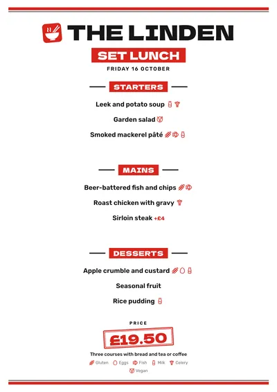
- Daily and weekly menus: centred, without numbers, each course under its bar and the price in a red stamp.
Tips to get the most out of it
- Encourage ordering by number: at the counter, on the phone and at the table, orders come out faster and with fewer mistakes.
- Don’t type the numbers by hand: they are added automatically and, if you change the order of the dishes, they renumber themselves.
- Red is the accent; a burgundy or a strong orange suit it too. Avoid light colours: the text on the bars is white.
- If you upload your logo, it replaces the bowl stamp.
Colours, fonts, columns and format can all be changed in the editor without losing the design. It works on A4, US Letter, slim A4, A5, booklet, tri-fold, A3 and images for social media.
 Block
Block Sumi
Sumi Taquería
 Market