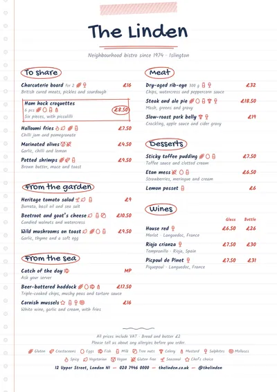
A notebook page
Notebook imitates a page torn from a notebook: faint horizontal rules, a red margin on the left, the punched holes for the rings and a strip of striped washi tape holding the page at the top. The venue’s name is set in Gochi Hand, handwriting with a fine marker-pen stroke.
Section titles are handwritten and circled with an oval of red biro. Dishes are set in Kalam, a clear, even handwriting face, with prices in red. A featured dish is boxed in by a hand-drawn frame, with its price circled.
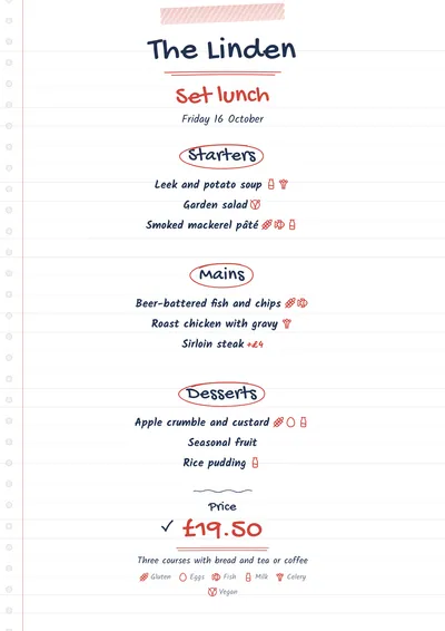
Designed for the daily menu too
Notebook works very well for menus that change every day: the jotted-down look makes it believable that it was written that same morning. On the daily menu, the title is in red, the headings for starters, mains and desserts are circled and the price has a tick in front of it.
Although it looks handwritten, it is comfortable to read. Even so, keep descriptions short: one line per dish is plenty.
Formats where it shines
- A5 or two A5s per sheet: the daily menu; with two per sheet, one sheet gives you two menus.
- Two-column A4: a café or home-cooking menu.
- 4:5 post or 9:16 story: to share the menu on social media.
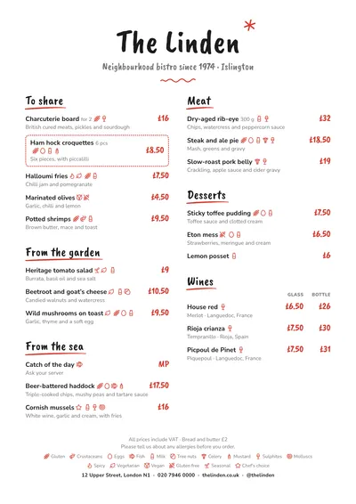
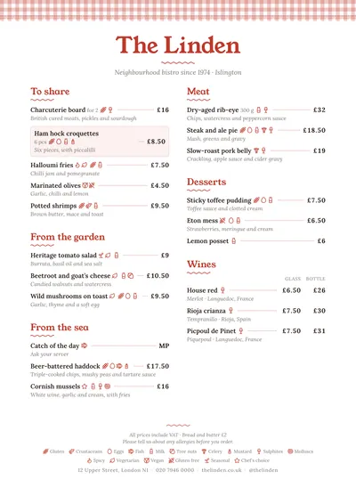
If you prefer the brush lettering of a chalkboard, compare it with Chalkboard. For a more traditional eating house, try Tablecloth.
Tips to get the most out of it
- It is perfect for menus that change daily: the jotted-down look makes it believable that it was written that morning.
- The blue ink imitates a biro and the red a marking pen; black as the ink doesn’t look out of place either.
- The lines and margin are very light: print on ordinary white paper, no need for lined paper.
- With two A5s per sheet, the daily menu prints twice and you cut it in half.
Colours, fonts, columns and format can all be changed in the editor without losing the design. It works on A4, US Letter, slim A4, A5, booklet, tri-fold, A3 and images for social media.
 Chalkboard
 Tablecloth
 Gazette
 Brunch