Lace, flourishes and price tags
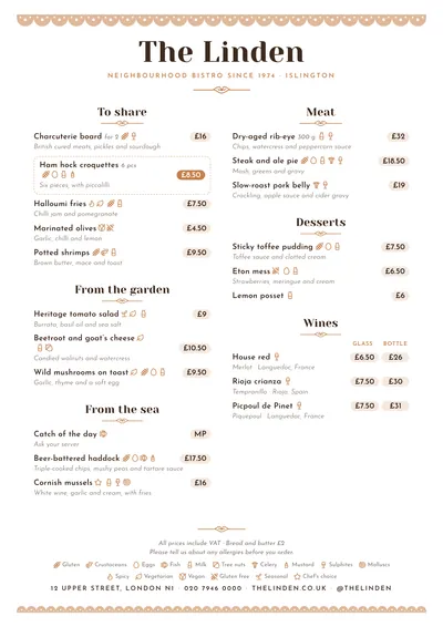
Bakehouse takes its cue from cake boxes and paper doilies. A scalloped, cut-out lace border in light caramel runs along the top of the page, with a finer one closing it at the bottom. The name is set in Yeseva One, a high-contrast typeface with the air of an old confectioner’s sign, with the subtitle underneath in spaced capitals and a small flourish.
Section titles are centred, each with its caramel flourish. Dishes are set in Josefin Sans, a geometric face with a 1930s feel, with descriptions in italics. Prices are not left loose: each one sits inside a rounded tag with a very soft caramel background, like the ones pinned on a shop counter. A featured dish is framed with a dashed line and its tag turns a deep caramel.
The menu it suits
Bakeries that bake on site, patisseries, cafés serving breakfast and afternoon tea, tea rooms and chocolate shops. It works with short menus and with long lists of items: pastries, toast, cakes by the slice and hot drinks. If you sell singly and by the dozen, price columns line the tags up under their headings, even when the heading is long.
The tone is warm and careful, without tipping into twee. For a more restrained speciality coffee shop, look at Nordic; for a brunch with more colour, try Brunch.
Formats where it shines
- Two-column A4: the full counter menu.
- A5 or slim A4: in one column, to leave on every table.
- 16:9 screen: above the display case, with prices clearly visible.
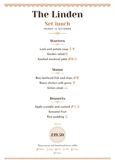
- Daily menu and social post: centred, with the scalloped price tag at the bottom.
Tips to get the most out of it
- Group by time of day (breakfast, afternoon tea) or by counter (pastries, savoury, drinks).
- If you sell singles, half dozens or dozens, use price columns: each tag sits under its heading.
- Caramel is the accent; a dusty pink or a sage green suit it too. Keep the ink dark so the text reads well.
- Highlight your signature bake: the featured style frames it with a dashed line and fills in its price tag.
Colours, fonts, columns and format can all be changed in the editor without losing the design. It works on A4, US Letter, slim A4, A5, booklet, tri-fold, A3 and images for social media.
 Brunch
 Nordic
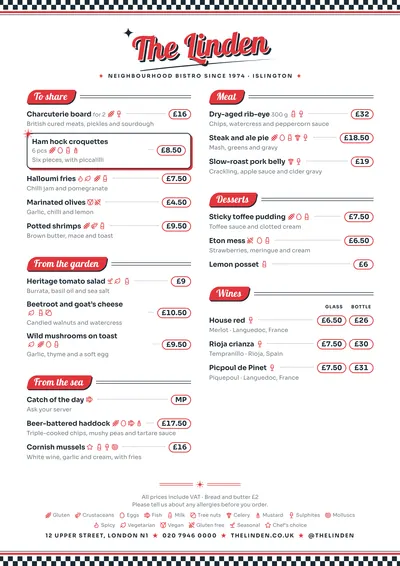 Diner
Diner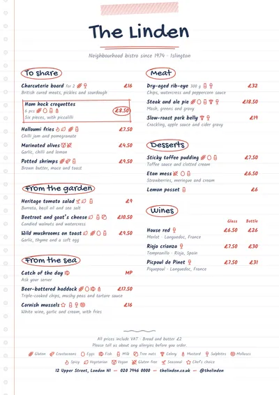 Notebook