A sign-painter’s frame and hops
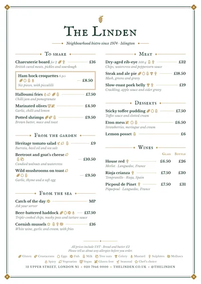
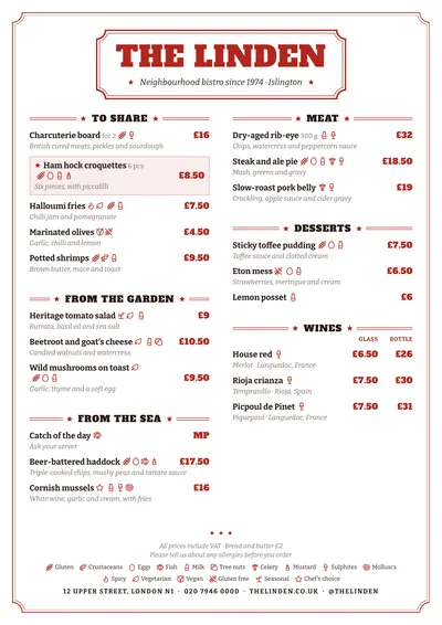
Pub takes its cue from the hand-painted signs and chalkboards of Irish and British pubs. The whole page is framed by a thick rule and a thin one, with a gold quatrefoil in each corner. Above the name sits a gold hop flower. The name is set in IM Fell English SC, 17th-century printer’s small caps with the slightly irregular stroke of metal type, and beneath it the motto in italics between rules finished with a diamond.
Section titles are centred in the same small caps, between two gold rules with a diamond. Dishes are set in Libre Baskerville, in bold, with descriptions in italics and gold dot leaders to the price. A featured dish is framed with a double gold rule, and at the foot the address and phone number are in capitals separated by diamonds.
The menu it suits
Irish and British pubs, taprooms, gastropubs and alehouses with a beer list. It is the style for taps poured in two measures: with price columns (“Half”, “Pint”), the headings are set in the gold small caps and the amounts line up in a column. Bar snacks, burgers and fish and chips fit on the same page.
For a matching wine list, use Bodega. If your bar is more counter and chalkboard than wood and brass, compare it with Market.
Formats where it shines
- Two-column A4: beers and food on a single page.
- A3 poster: next to the bar, like a pub sign.
- 16:9 screen: the tap list above the pumps.
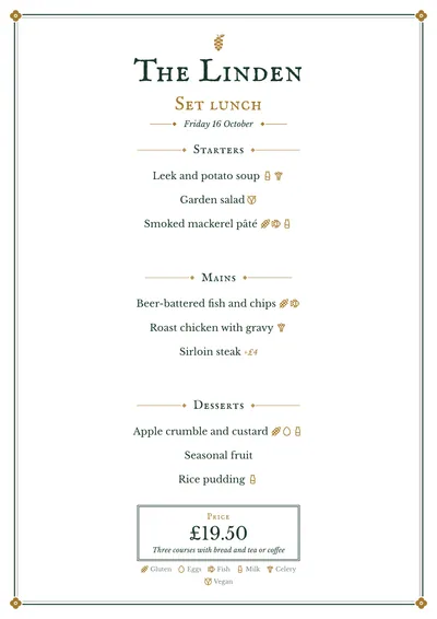
- Daily menu: centred, with the price on a double-ruled plaque.
Tips to get the most out of it
- For the taps, use two price columns (“Half” and “Pint”): the amounts line up under their headings.
- Put each beer’s style and ABV in the description, which is set in italics.
- Racing green and gold are the style; a burgundy or a very dark navy with the same gold also work.
- Keep the dot leaders: with long dish and beer names they help guests follow the line to the price.
Colours, fonts, columns and format can all be changed in the editor without losing the design. It works on A4, US Letter, slim A4, A5, booklet, tri-fold, A3 and images for social media.
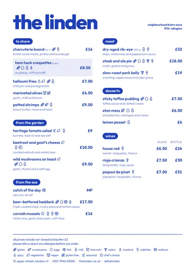 Riviera
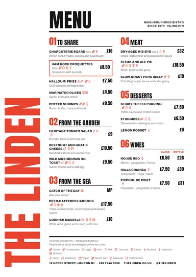 Poster
 Vermouth
 Chalkboard