 Signature
 Sumi
Sumi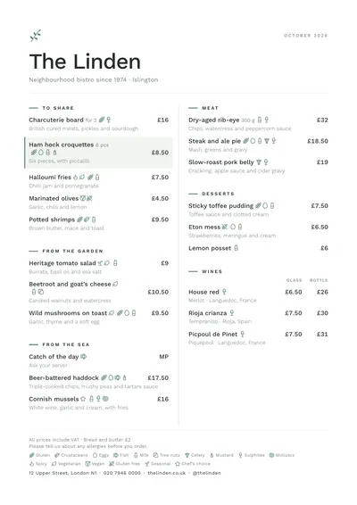 Nordic
 Swiss
Swiss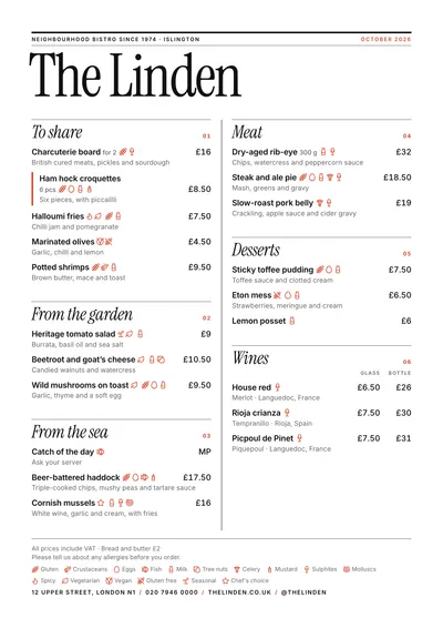 Editorial
 Milano
 Riviera
What a minimalist menu is
A minimalist menu removes everything that doesn’t help people choose: frames, textures, decorative icons, second and third fonts. What’s left (name, sections, dishes, prices, allergens) is organised with very few devices.
One typeface. A single family with its weights and italic. Geometric or neutral sans serifs, or a restrained serif.
One colour. Black or a very dark ink and, at most, an accent on one detail: a seal, a square, a short rule.
Plenty of margin. The white around and between sections is what makes the menu look cared for. More space between sections than between dishes, and more between dishes than between a name and its description.
Strict alignment. Either everything centred or everything ranged left. Centring works on short single-column menus; ranged left on longer ones.
Discreet prices. After the description or in a narrow column, without the currency symbol on each line and with a note at the foot that makes it clear.
Paper. White or ivory, matt, with a good weight. On a menu this bare, the paper shows.
Mistakes that turn it into a poor menu
- Confusing minimalist with incomplete. Allergens and pricing information have to be there. They can be shown with discreet icons or numbers and a key at the foot, but they can’t be removed.
- Light grey on white. Very elegant on screen, illegible at the table. Grey for headings is fine; for descriptions, it isn’t.
- Tiny type to fit everything in. If it doesn’t fit with room to breathe, you have too many dishes or too small a format.
- A fifty-dish menu. Minimalism and abundance don’t get on. Cut back or move to a booklet.
- Hidden prices in a barely visible tone. Discreet, yes; hidden, no.
How to write the dishes
The text is minimalist too. The main ingredient and two or three elements, separated by commas, with no adjectives:
- “Squash, miso, hazelnut”
- “Sea bass, fennel, citrus”
If your guests aren’t used to this register, add a line explaining the dish: “Grilled sea bass with roast fennel and a citrus sauce”. Minimalist doesn’t mean cryptic.
Seven minimalist designs
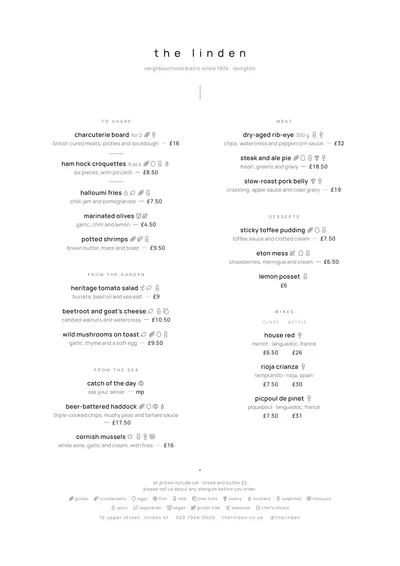
Signature is the extreme: everything in lowercase, small text, headings in a faint grey and everything centred. For tasting menus and chef-led cooking.
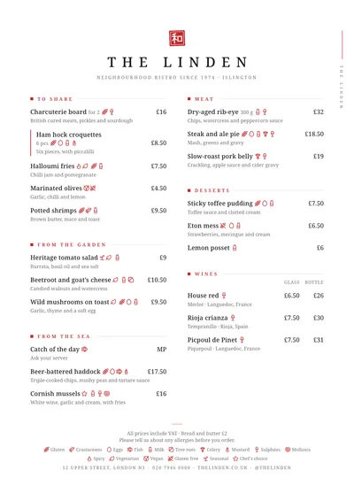
Sumi uses a red seal as its only colour, widely spaced capitals and hairline rules. For Japanese cooking and short menus looking for calm.
Nordic ranges everything left, with Work Sans, fine rules and a sage-green sprig. For cafés, bakeries and healthy food.
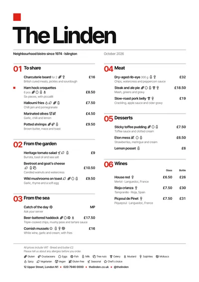
Swiss reduces ornament to a red square and trusts the grid: large section numbers and everything ranged left.
Editorial is minimalism with character: a huge masthead, fine black rules and numbered italic sections.
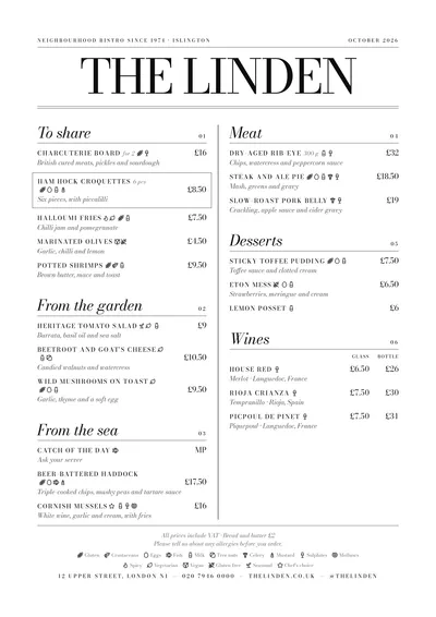
Milano does without colour and relies on the contrast of Bodoni. Magazine black and white.
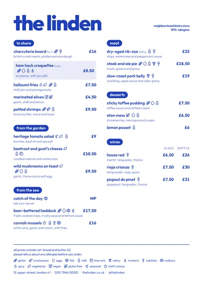
Riviera solves everything with a single ink and the weight of the type. Informal minimalism, bar-style.
Format and paper
The format that suits minimalism best is the slim A4 (140 × 297 mm): one column, lots of margin and a menu you can hold in one hand. For long menus, the booklet spreads the dishes out without squeezing them. And for a daily menu, a centred A5.
In MenuDesign the type size adjusts itself to fill the page: with a short menu it grows and gains presence; with a long one it shrinks, without going below a readable minimum. If the menu needs more room, change format rather than squeeze. See every design in the menu designs gallery, the rules of space and hierarchy in restaurant menu design and how to pick a single typeface that does it all in menu fonts.
Frequently asked questions
Can a minimalist menu show allergens?
It has to. So they don't spoil the clean look, use small icons or numbers next to each dish and a key at the foot.
How many dishes fit on a minimalist menu?
There's no set number. But if you have to shrink the type or cut the margins to fit them, you have too many dishes or too small a format: the slim A4 or the booklet help.
Which colours should I use?
A very dark ink for the text and, if you like, an accent on a single detail. Light grey only for short headings; never for descriptions.