
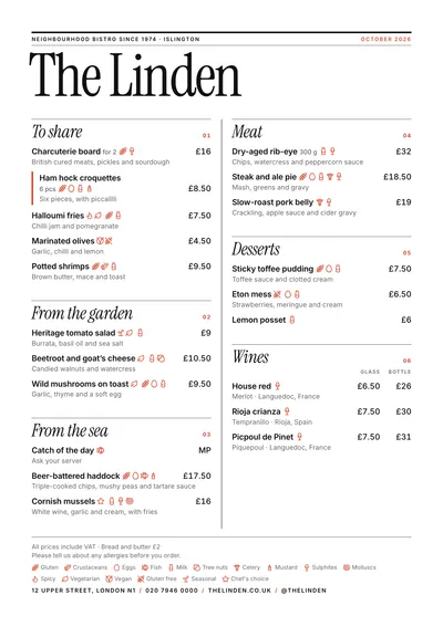
 Editorial
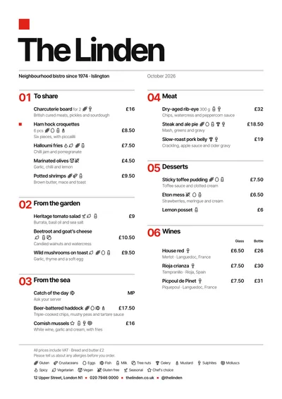 Swiss
Swiss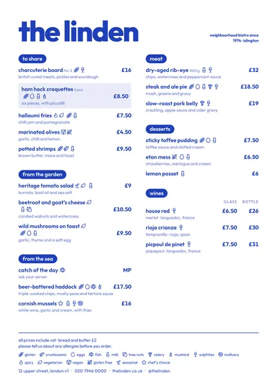 Riviera
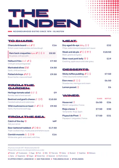 Screenprint
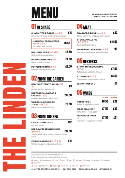 Poster
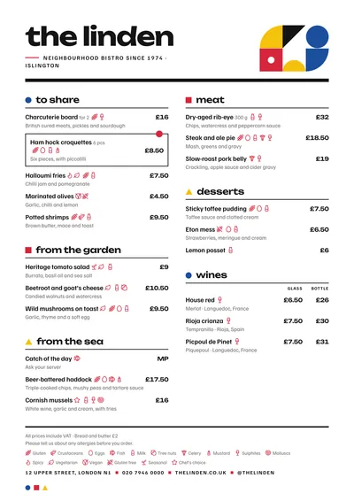 Bauhaus
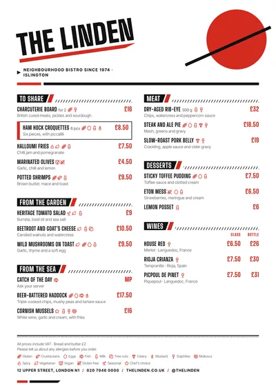 Constructivist
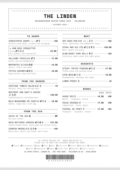 Ticket
What makes a menu modern
Type with contrast. A huge venue name and small, clean text. Modern menus play with very marked differences in size rather than with ornaments. Neutral sans serifs or contemporary display serifs, almost always paired with a sans serif for the text.
A grid. Defined columns, fine rules, section numbers, everything aligned to an axis. Many modern menus are set ranged left and keep centring for the daily menu.
Colour. One ink and a bright accent, or simply a single ink. The accent appears in few places, and that’s why it stands out.
Space. White space is used as an element in its own right: asymmetry, wide margins, air between sections.
The support. White matt paper, a wooden board with a clip, elongated formats. And the same menu adapted for screens and social media, because many customers see it on their phone before they see it on the table.
Common mistakes
- Three “modern” fonts at once. One good sans serif with its weights covers everything.
- Light grey at a tiny size. It looks very clean on a computer screen and can’t be read at a dimly lit table.
- Unexplained wordplay. If customers have to ask what every dish is, the menu isn’t working.
- Decorative icons that mean nothing and get confused with allergen icons.
- Full-page colour backgrounds printed on an office printer: they come out banded and use a lot of ink.
- A different idea in every section. Consistency is what makes a menu look designed.
How to write the dishes
Direct and concrete. A short name and, underneath, what’s in it:
- “Tomato, peach and basil”
- “Crispy duck rice, wild mushrooms and parmesan”
Sections can have their own names (“To start”, “From the sea”, “Fire”), as long as they’re clear. Avoid mixing languages in headings just for decoration; if you need a second language, use the bilingual menu, which puts the translation under every dish and next to every heading.
Eight modern designs
Editorial lays the menu out like a magazine: a huge masthead in Instrument Serif, numbered italic sections and fine black rules. For bistros and produce-led restaurants.
Swiss is the pure grid: a red square, the name set tight in Inter Tight, big section numbers and everything ranged left, the daily menu included.
Riviera works in a single ink, with heavy lowercase and headings in pills. For modern gastropubs and bars with character.
Screenprint mimics a two-colour poster, with the registration slightly off and a halftone dot pattern in the corner. For specialty coffee shops and brunch.
Poster runs the venue’s name vertically down the edge, huge and in red, with numbered sections in Anton. A poster you read up close.
Bauhaus combines circle, square and triangle in the three primaries, with the text in lowercase and strict alignment.
Constructivist is an avant-garde poster: a big red circle, a slanted name and diagonal bands. For cocktail bars and places with attitude.
Ticket turns the menu into a till receipt, in a monospaced font, with zigzag edges and a barcode. For wine bars and gastropubs.
Formats: paper and screen
On paper, a two-column A4 is the workhorse format, and the slim A4 (140 × 297 mm) feels more current in a single column. For the wall or the window, the A3 poster. And the same content gives you the 4:5 post, the 9:16 story and the 16:9 screen for the TV in your venue, in the same design.
Every design lets you change the ink, the accent, the paper and the fonts, and the type size and columns adjust themselves to fill the page. Compare them with your real menu in the menu designs gallery. To choose the accent, see restaurant menu colours, and for the basic rules, restaurant menu design.
Frequently asked questions
Which font should I use for a modern menu?
A neutral sans serif for the text (along the lines of Inter or Work Sans) and, if you want character, a contemporary serif or a condensed face for the name and headings. Two families at most.
Does modern mean no colour?
No. Many modern menus use a bright accent, but in very few places: section numbers, a square, the headings. Everything else is a dark ink on white.
Can I have the same menu on paper and on screen?
Yes. In MenuDesign the same content comes out as an A4, A5, booklet or tri-fold, and also as a social media post, a story or a 16:9 screen, in the same design.