
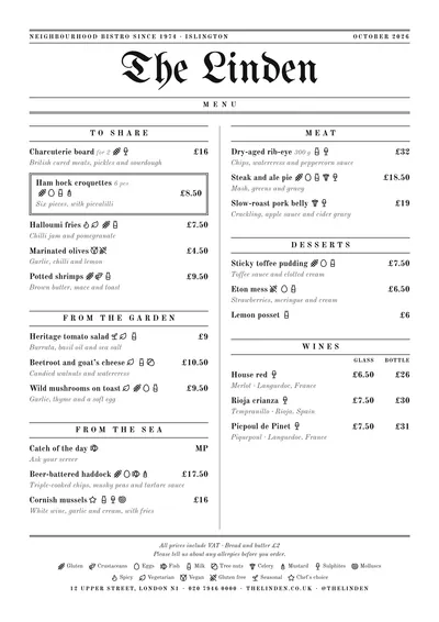
 Gazette
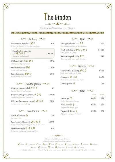 Modernista
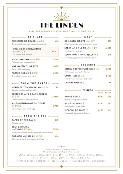 Déco
Déco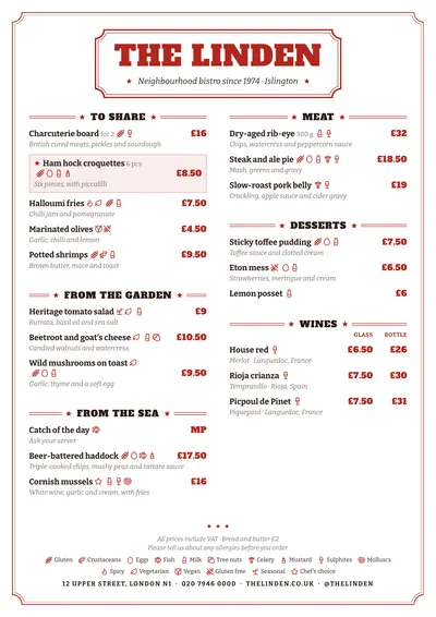 Vermouth
 Tinned
 Diner
Diner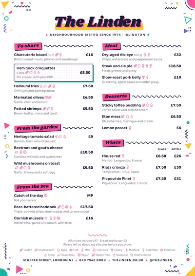 Memphis
First, the era
“Vintage” can mean a dining room from 1900 or an American diner from the fifties. Before choosing a font, decide which era your venue belongs to:
| Era | Features on the menu | Design |
|---|---|---|
| Nineteenth-century press | Blackletter masthead, double rules, columns divided by rules | Gazette |
| Art Nouveau, around 1900 | Whiplash curves, flourishes, mosaic | Modernista |
| The 1920s | Sunburst fans, stepped frames, gold | Déco |
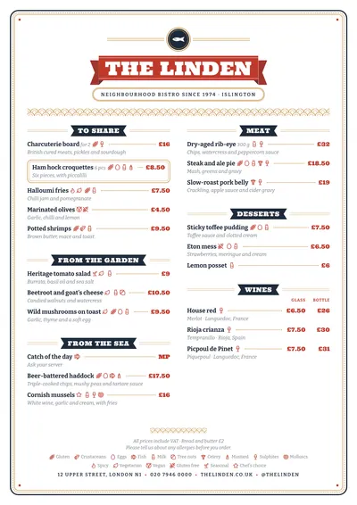
| Old labels | Slab type, stars, ribbons, tin-style frames | Vermouth, Tinned |
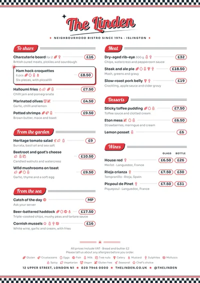
| The 1950s | Shadowed script, chequerboard, badges, stars | Diner |
| The 1980s | Geometric confetti, pop colours | Memphis |
Type, ornament, colour and paper
Type. Every era has its display type: blackletter, Art Nouveau lettering, Art Deco poster faces, heavy label slabs, sign-painter scripts. Use it only for the name and headings; for the dishes, a comfortable serif or sans serif.
Ornament. Rules, stars, diamonds, frames. Few of them, and always from the same repertoire.
Colour. Many old menus and labels were printed in one or two inks: black, red, a gold, a navy. Limiting yourself to two colours is the quickest way to make it look authentic.
Prices. Many old menus set prices in a column, joined to the dish by dot leaders; Tinned and Diner do it that way. In Gazette and Vermouth they sit in bold on the right. In every case, better without the £ sign on each line and with a note at the foot.
Paper. Off-white or cream, matt. If you print on cream paper, check that the accent still has contrast.
Mistakes that give away a template retro
- Mixing eras: Wild West type, an Art Deco frame and polka dots on the same sheet.
- Fake textures: coffee stains, crumpled paper or wood printed as a background. They use ink and muddy the reading.
- Decorative type everywhere, descriptions included.
- Ageing with filters: sepia on sepia, and the text loses contrast.
- Prices on stickers: they break the effect more than anything else.
How to write the dishes
The tone follows the era. On an old-fashioned menu, the classic names and formulas work: “Potted shrimps”, “Steak and kidney pudding”, “Speciality of the house”. In a diner, the all-time combinations: “Double cheeseburger and fries”. Avoid mixing the vocabulary of avant-garde cooking with a 1920 masthead: it shows.
Seven period designs
Gazette turns the menu into the front page of an old newspaper, with a blackletter masthead, double rules and the word “Menu” on a band. Very rewarding for taverns and old-style dining rooms.
Modernista brings back Barcelona around 1900: whiplash corners, flourishes between headings and a trencadís mosaic frieze on the daily menu.
Déco is pure 1920s: a gold sunburst fan, a stepped frame and Limelight type. For cocktail bars and gala dinners.
Vermouth sets the header inside a bottle label with cut corners, in red slab type with stars. For aperitif hour.
Tinned imitates the label on a tin of sardines: a rounded frame, a red ribbon with tails and gold scales.
Diner is the fifties American diner: chequerboard, the name in red shadowed script and prices in pills.
Memphis brings eighties pop: confetti of triangles and zigzags, Shrikhand type and tilted blocks of colour.
Formats that suit them
A4 is the natural format for most of them, and the A3 poster turns them into a period poster for the wall. Gazette and Vermouth look great on the daily menu in A5; Déco and Modernista in a booklet with a cover.
In almost all of them the ornaments follow the accent colour, so you can adapt the design to your venue without leaving the era. Compare them in the menu designs gallery and, for choosing type, see menu fonts. To combine inks the way old labels did, the guide to restaurant menu colours will help.
Frequently asked questions
Can I print a vintage menu on cream or kraft paper?
Yes, as long as the text still has enough contrast. Test first: light accents such as gold lose strength on darker paper.
What's the difference between a vintage menu and a rustic one?
A vintage menu imitates a particular era (the 1920s, the 1950s). A rustic menu imitates a kind of place: a country pub, a grill, a home-cooking café. Sometimes they overlap, as in Gazette or Vermouth.
Are period fonts easy to read?
In these designs the period type is used for the name and headings; the dishes are set in comfortable reading fonts such as Old Standard, Cormorant Garamond, Bitter or Sora.