Wedding stationery
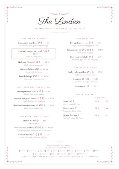
Romance takes its cue from wedding invitations. The name is set large in Parisienne, a fine copperplate script, with a posy of leaves and a little flower above it. Below it come the subtitle in widely spaced Cormorant Garamond capitals and a small heart between two fading rules.
Each section title is in spaced capitals, in dusty pink, between two leafy sprigs that stretch out into a rule. Dishes are centred, with the description in italics underneath; if they have a price, it follows the name in the accent colour. A fine double frame with a posy in each corner holds the whole page together, and a featured dish is framed in a double-lined tag.
The menu it suits
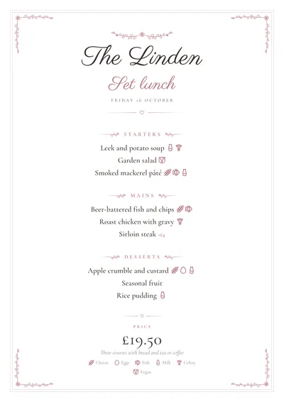
Wedding, christening and celebration menu cards, menus for events and wedding venues, and short patisserie or tea room menus. It is a style for a few well-chosen dishes: on a menu card, one dish per line, no prices, and the wines on a single line (“Chablis · Rioja · Champagne”).
On a fixed-price menu, the menu’s name is also in calligraphy and the price appears at the bottom, large and in Cormorant. For a restaurant’s long menu, so much centring gets long-winded; there, Sobremesa fits better, sharing the calm without the flowers and hearts.
Formats where it shines
- DL card (99 × 210 mm): the classic wedding menu card, one per place setting.
- Three DLs per sheet: three menu cards on each A4, ready to cut.
- A4: the banquet menu in one column, or two if the menu is long.
- Booklet: with a calligraphy cover for an events venue’s menu.
The frame and sprigs are very fine lines and use hardly any ink, so you can print the menu cards at home on white card. If you want a more 1920s party feel, compare it with Déco.
Tips to get the most out of it
- For a wedding menu card, use the DL card (99 × 210 mm): one per place setting or one in the centre of each table.
- Write the names with an “&” in the middle (“Emma & James”): in calligraphy it is the detail that shines most.
- Keep a soft accent (dusty pink, sage green, misty blue): the frame, the sprigs and the prices follow it.
- A menu card doesn’t need prices or long descriptions: one dish per line and the wines together on a single line.
Colours, fonts, columns and format can all be changed in the editor without losing the design. It works on A4, US Letter, slim A4, A5, booklet, tri-fold, A3 and images for social media.
 Winter
 Bakehouse